Gilt Exploration
Gilt exploration are mocks that were made for the upcoming quarter to refresh templates, imagery, color, and typography to be used and built into exisiting boutique doors. Innovation was key while still remaining true to the brand identity.
I was involved in the 2024 Q4 mocks which historically include the biggest sale weekend of the year involving Cyber Week and holiday sales, as well as the 2025 Q1 and Q2 mocks. There is close collaboration with copywriters and art directors to ensure alignment on the theme of the new quarter. Designs go through multiple rounds of review before being passed up to leadership for final approval and ideally finally being used on-site.
I was involved in the 2024 Q4 mocks which historically include the biggest sale weekend of the year involving Cyber Week and holiday sales, as well as the 2025 Q1 and Q2 mocks. There is close collaboration with copywriters and art directors to ensure alignment on the theme of the new quarter. Designs go through multiple rounds of review before being passed up to leadership for final approval and ideally finally being used on-site.
Programs:
✽ Adobe Photoshop
✽ Adobe After Effects
Skills:
✽ brand identity
✽ graphic design
✽ motion design
✽ Adobe Photoshop
✽ Adobe After Effects
Skills:
✽ brand identity
✽ graphic design
✽ motion design
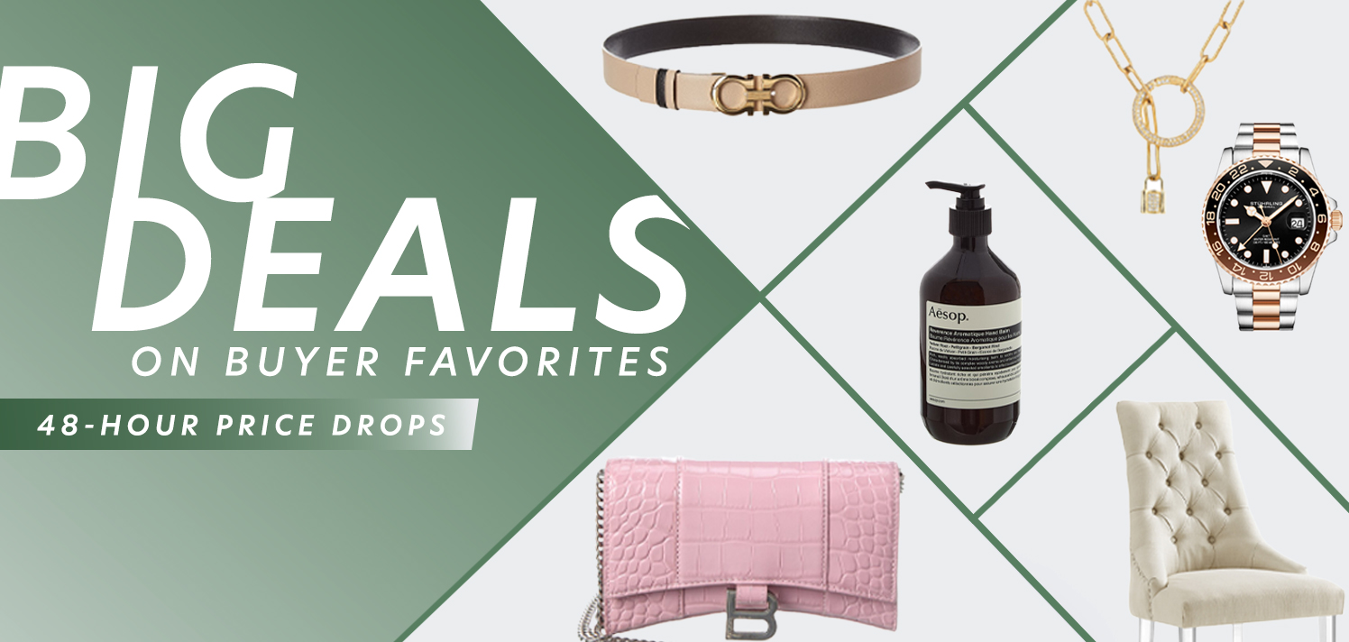
Q4 2024
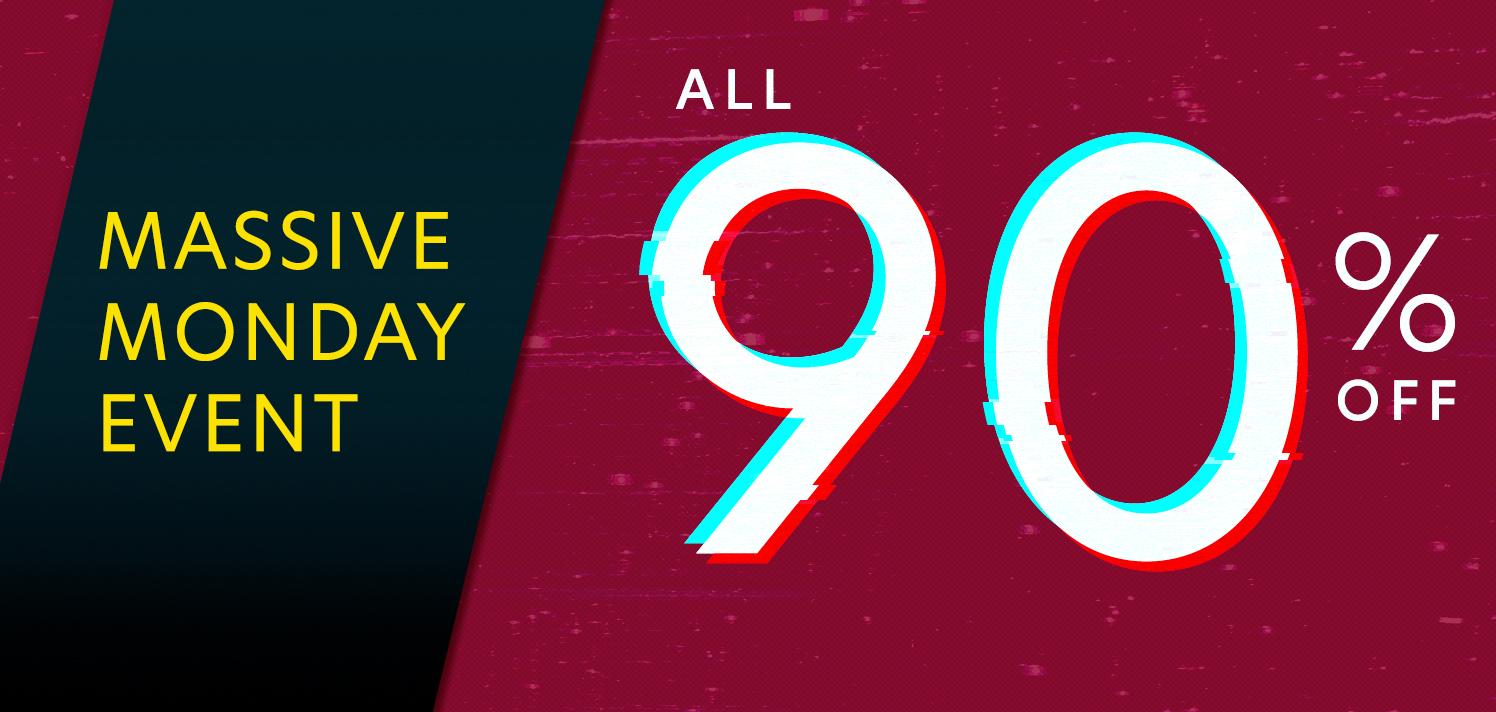
Designed to feel completely different from any assets that were currently live on site. The brief for Q4 mocks was to break the mold and refresh the sale model to attract customers’ attention in a whole new way with color, typography, and imagery treatment. This exploration was a collaboration between my manager and I, where I launched initial concepts and my manager chose a few components to bring to fruition.


Precyber assets. These are meant to launch before the official sale weekend and be an introduction to the cyber sale concepts and to get customers excited.
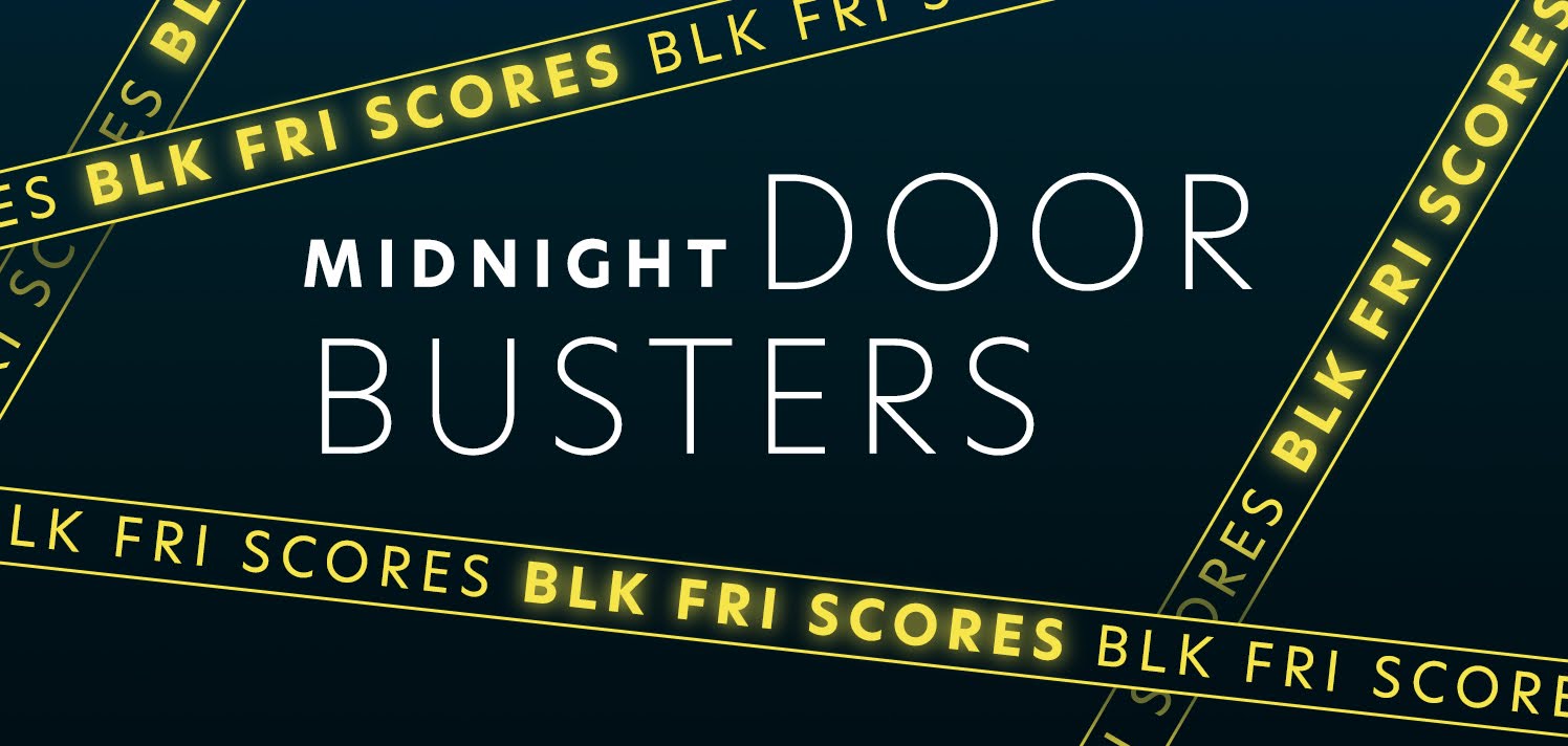


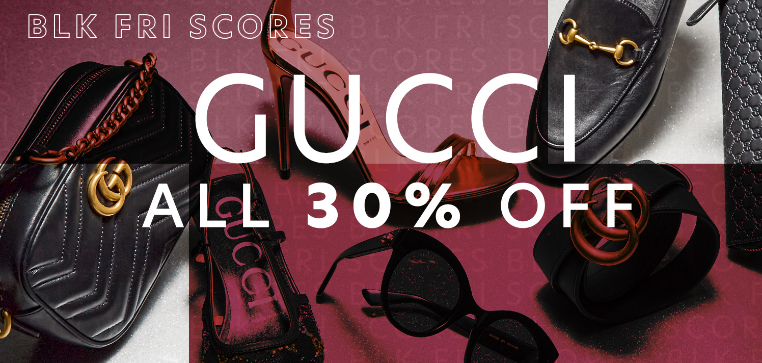
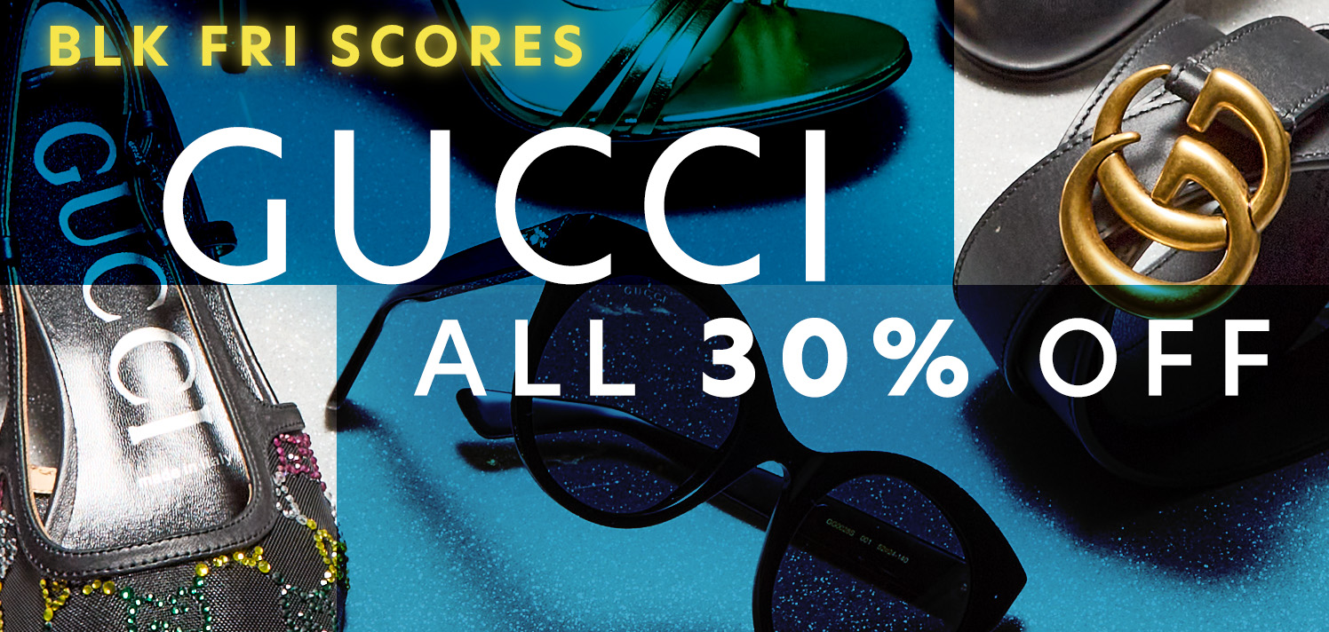


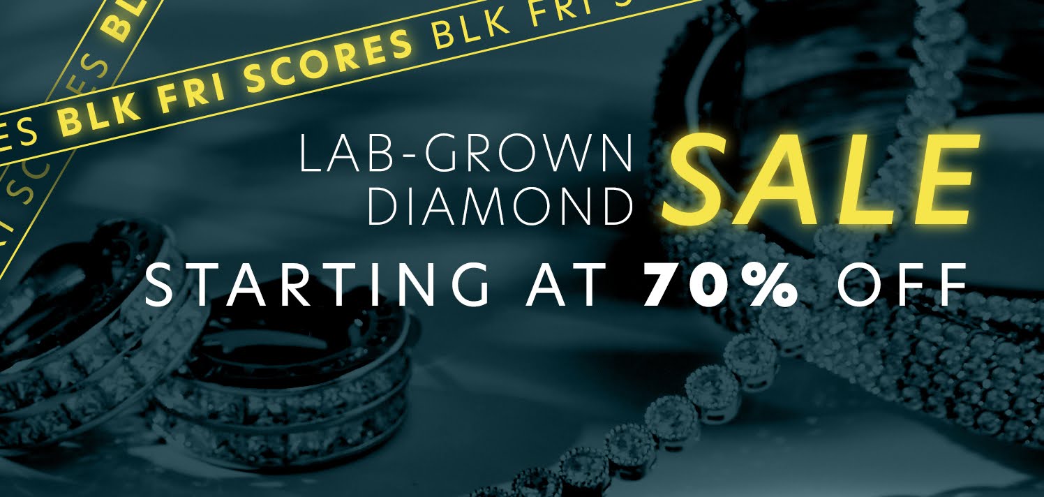
Black Friday assets. The biggest sale day of the year. These assets really need to draw customer attention and bring in high sales.


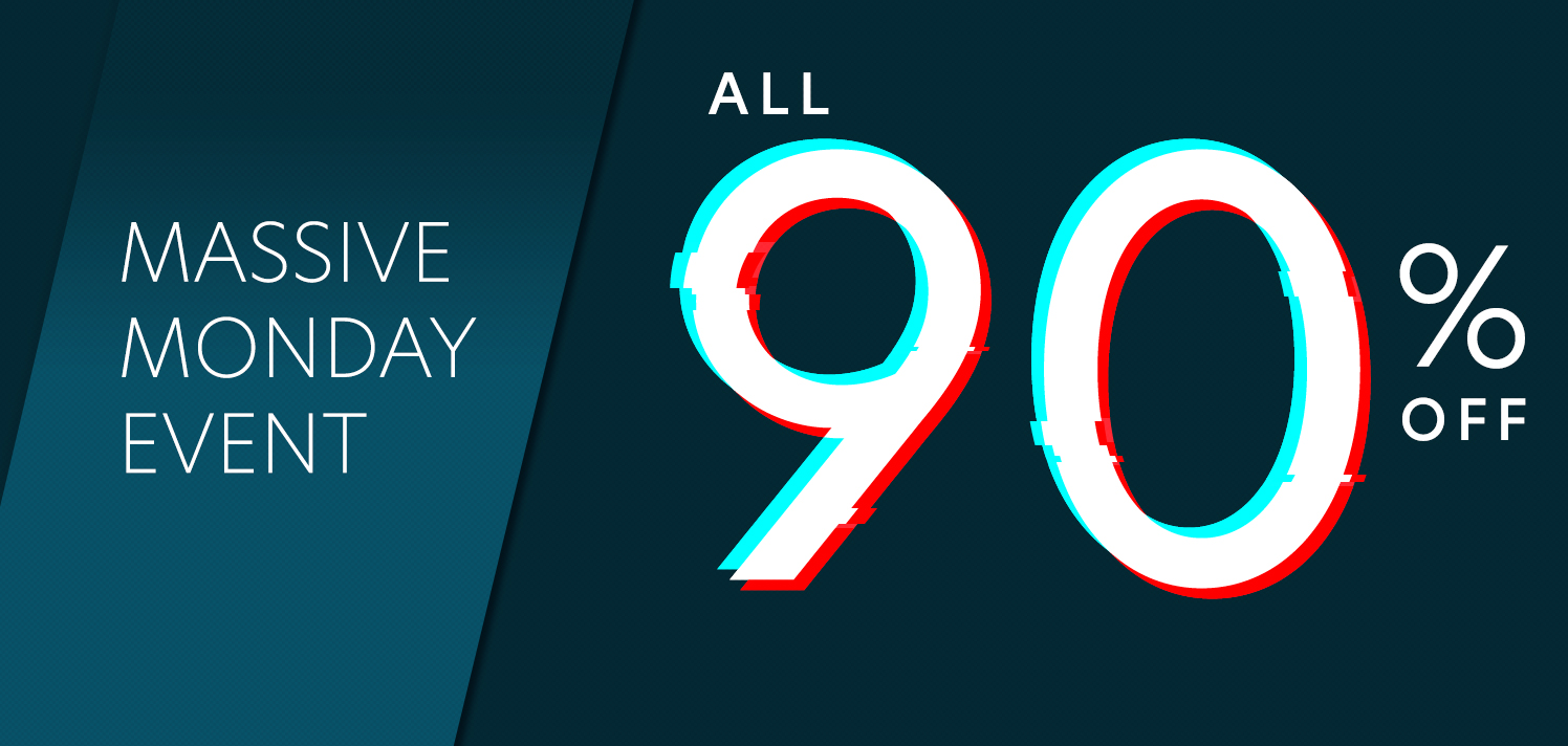


Cyber Monday assets. Still a big emphasis on sales and trying to finish off the holiday weekend strong.
Q1 2025
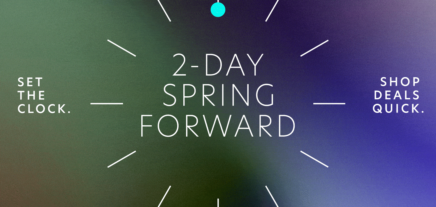
The main focus on Q1 mocks was to differentiate assets between the Gilt and RueLaLa sites. New templates to treat on-model imagery was created to be built into the existing working template and a tag was created for any sales that will be run.

The main focus in this set of assets is the promotional tag that was used in all long weekend promotions from MLK Day, Presidents Day, Memorial Day, and so on. Here you can see an example set of assets where the promotion tag is used in its original lockup as well as iterations of the tag to suit a different asset context.


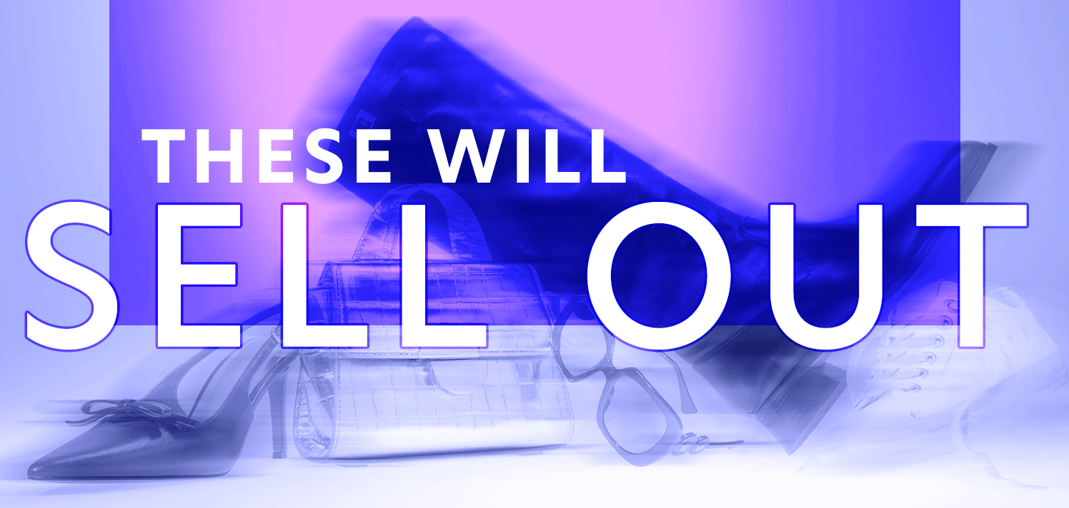
This exploration was to highlight a “trend” or key product. The design is purposely kept clean to spotlight the item but there is a focus on type alignment in the tag and replication across categories. Unfortunately, this concept was not ultimately used on site but was a good practice in simple but effective design.
These graphic explorations would go on to become staples in on-site template rotations. The right-most diagonal template is routinely a best-seller and consistent in high sales. The left-most purple GIF is effective is showing a variety of product while keeping file sizes small since the animation is created in Photoshop instead of After Effects.
Q2 2025
Q2 mocks differentiate slightly from the previous quarterly mocks where the focus is less on the design and more on the copy/voice of the Gilt brand. Designs showcase copy changes and a new tagline that works within a variety of sale promotions.

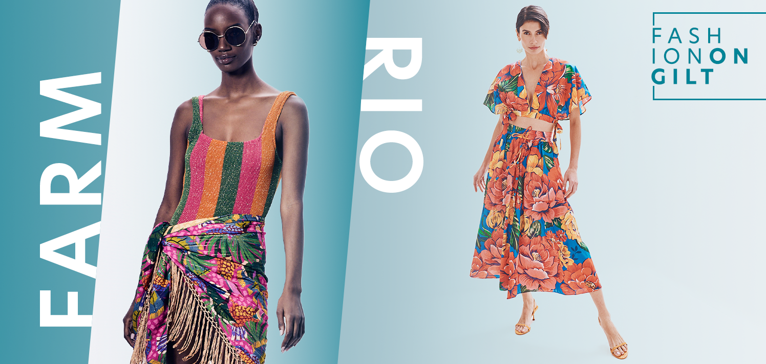

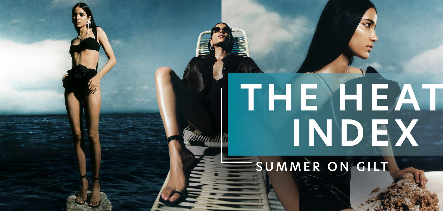
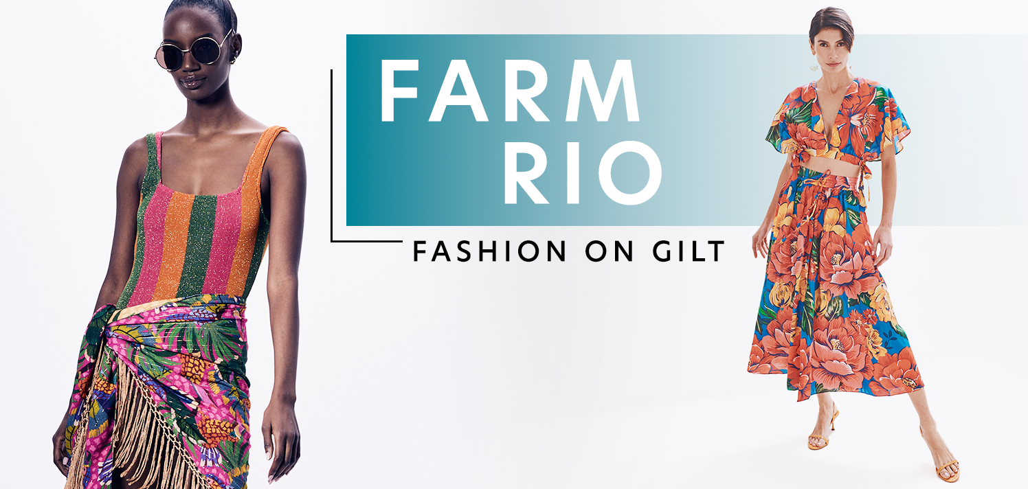
In this set of assets a tag is created to work across a variety of categories and concepts: “Summer on Gilt”, “Fashion on Gilt”, “Beauty on Gilt”, and more. The exploration is focused on how to showcase multiple images in a different manner (The Heat Index) and refreshing the branded assets template (Farm Rio).