Gilt/RueLaLa Boutiques
Boutique doors are essentially the designed assets that go live across desktop and mobile sites on gilt.com everyday. Most of the day-to-day work is centered around creating these assets as well as maintaining close communication with project managers, art directors, copy writers, and fellow designers to coordinate all the necessary information.
Additional projects on top of the “boutique doors” include emails, mocks for the upcoming quarter, website banners, and unique in-app assets.
Additional projects on top of the “boutique doors” include emails, mocks for the upcoming quarter, website banners, and unique in-app assets.
Programs:
✽ Adobe Photoshop
✽ Adobe After Effects
Skills:
✽ brand identity
✽ graphic design
✽ motion design
✽ photo editing/retouching
✽ Adobe Photoshop
✽ Adobe After Effects
Skills:
✽ brand identity
✽ graphic design
✽ motion design
✽ photo editing/retouching
Overview of Workflow
Key elements of every single asset created includes:
✽ seasonality - does the imagery correctly represent the current season or holidaay
✽ image selection - does the imagery match the brand identity (Gilt vs RueLaLa), or is the selected model shots the most compelling out of the shoot
- Rue is considered the more boutique and lifestyle brand
- Gilt is considered the more high-end and luxe brand
✽ color - does the tonal background match the current color palette or feel in line with the “vibes”
✽ copy - is there copy included on the door, does the copy correctly represent the products displayed or vice versa
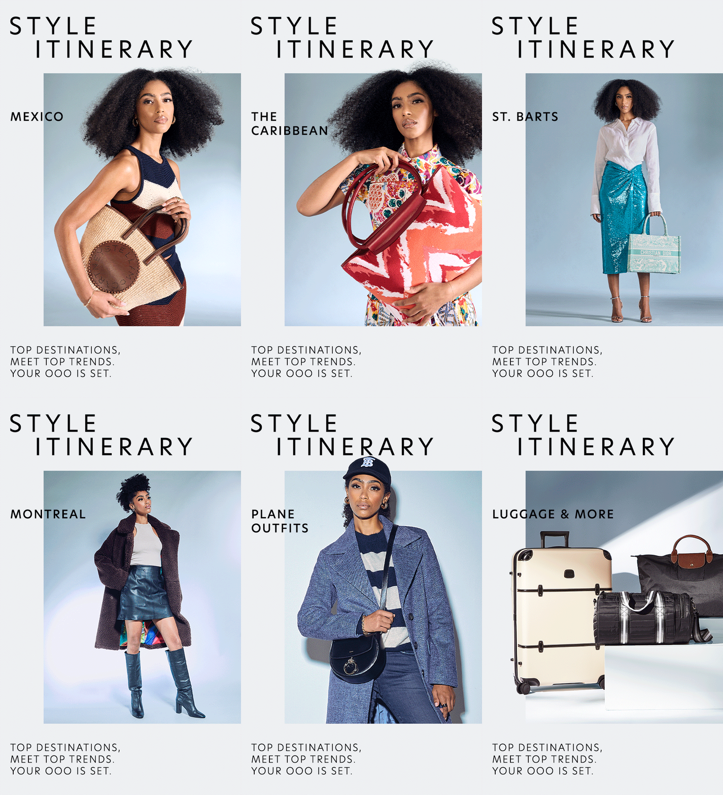
On Model Example
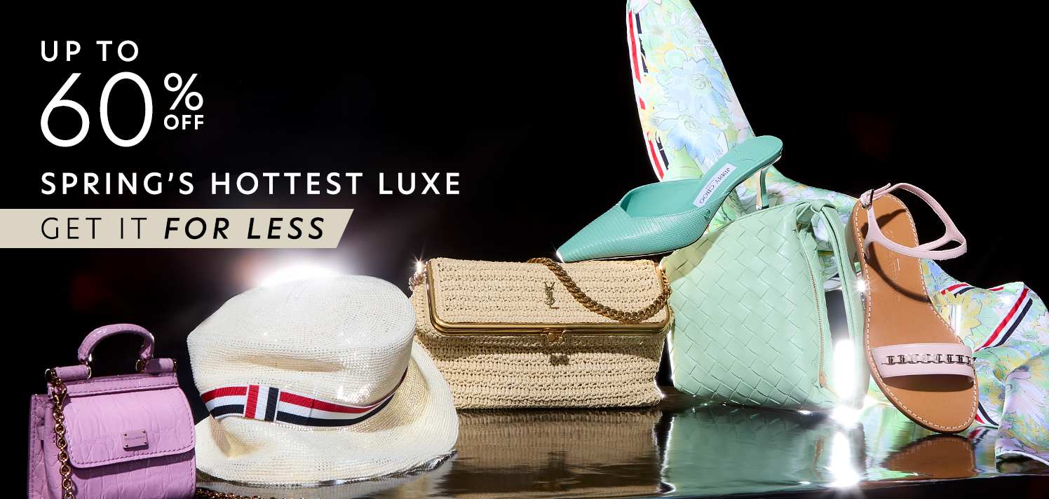
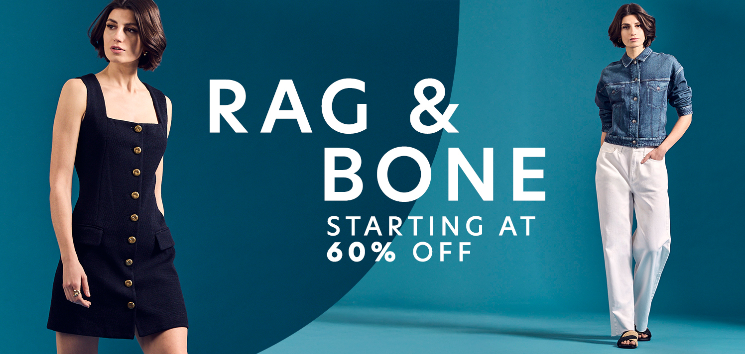
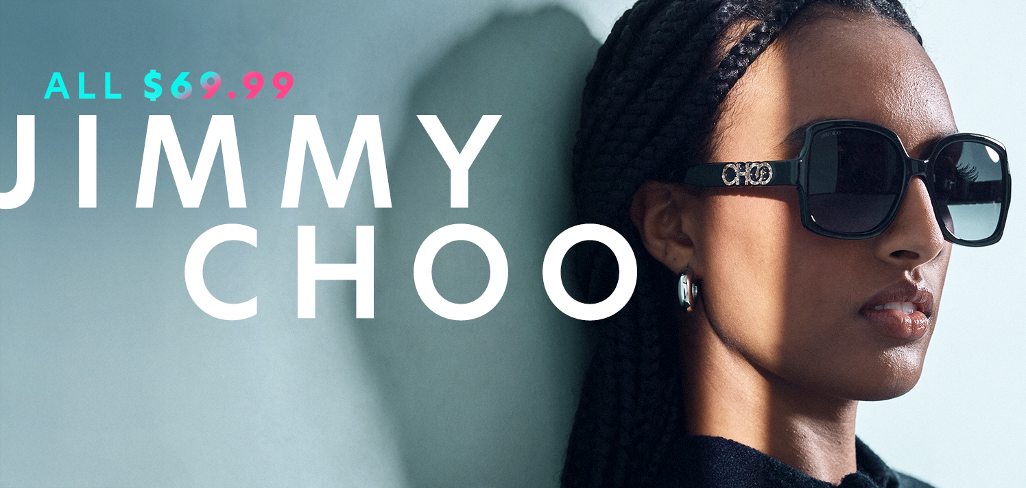
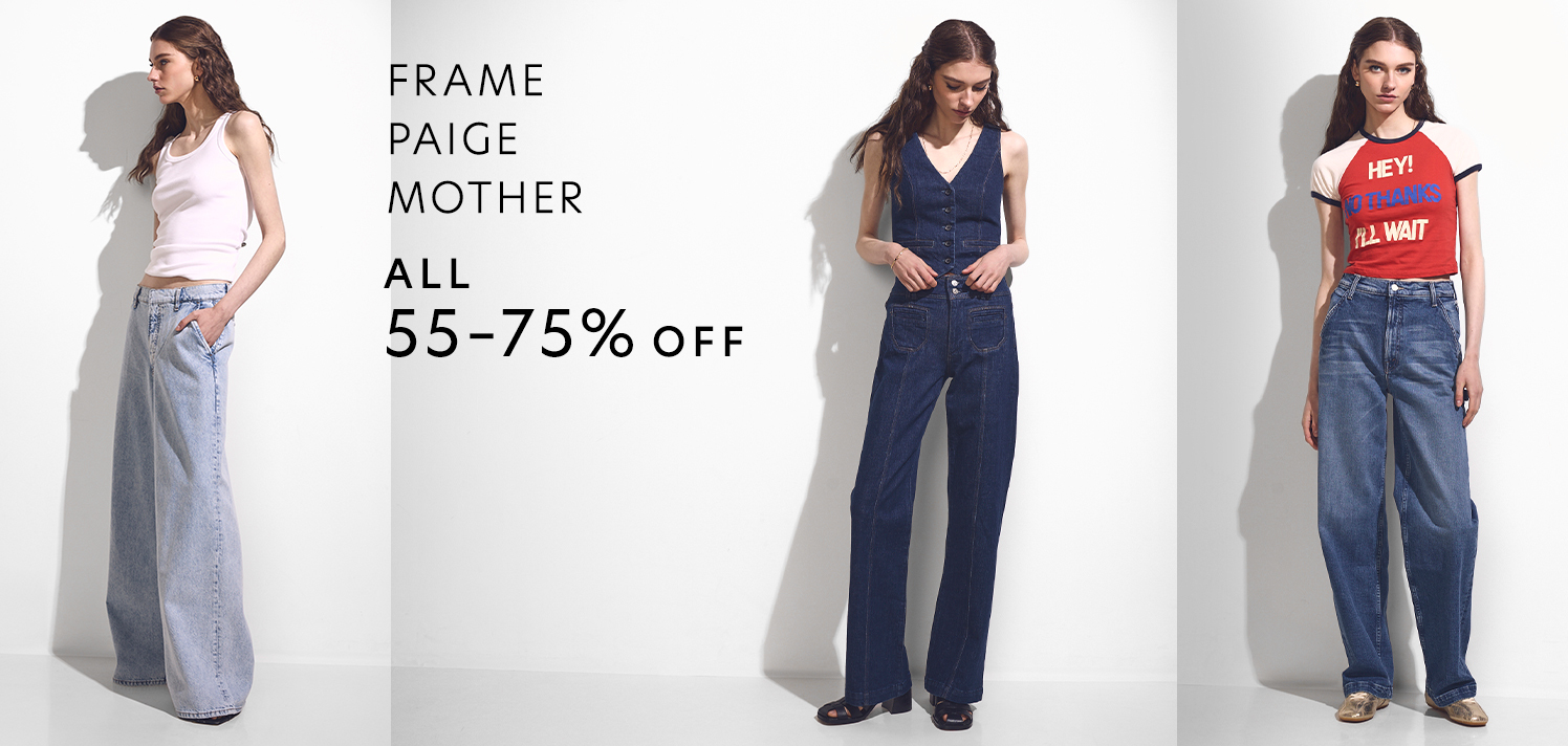
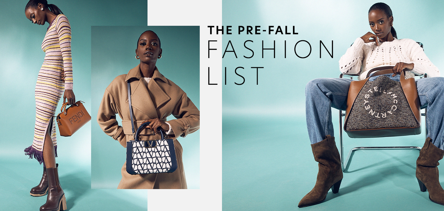
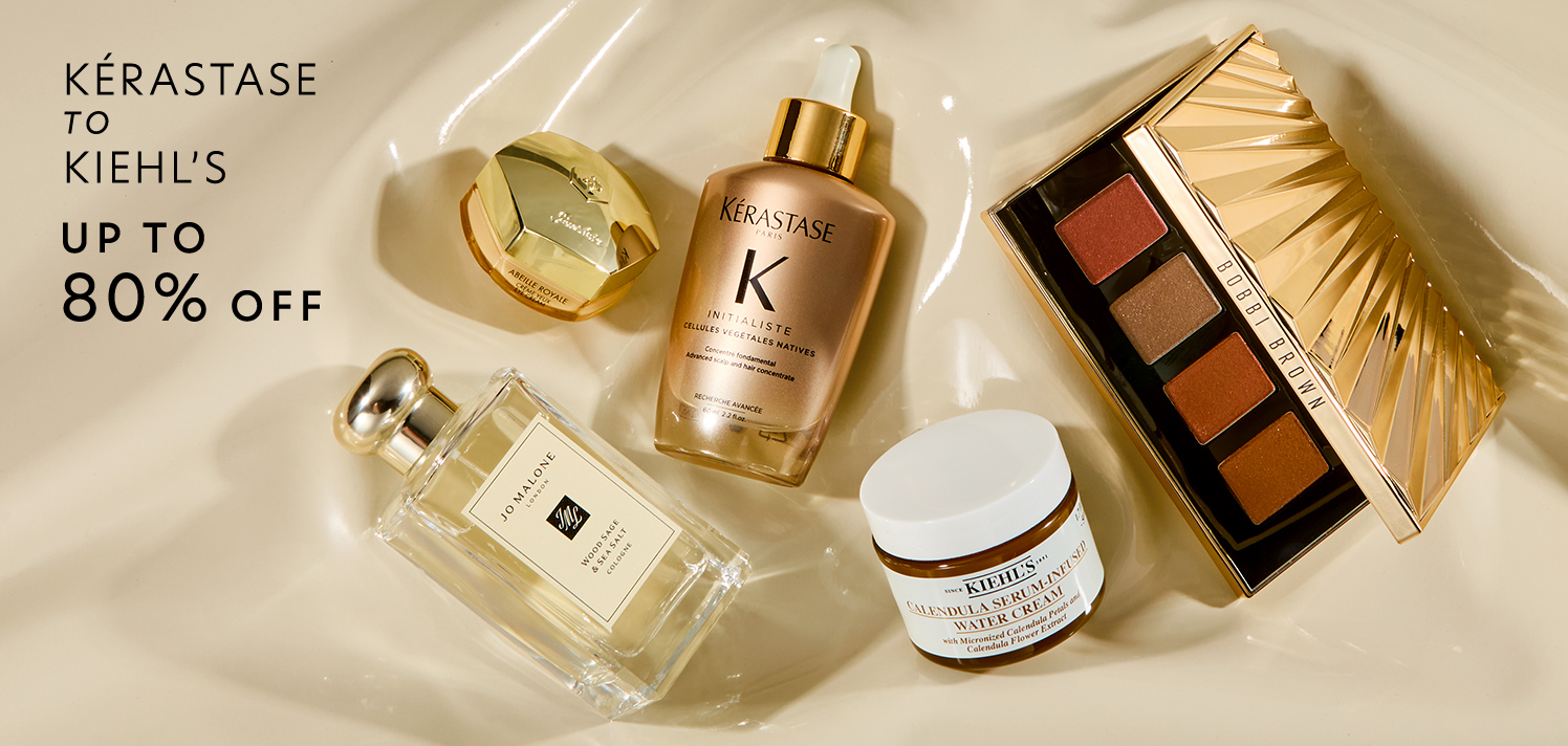
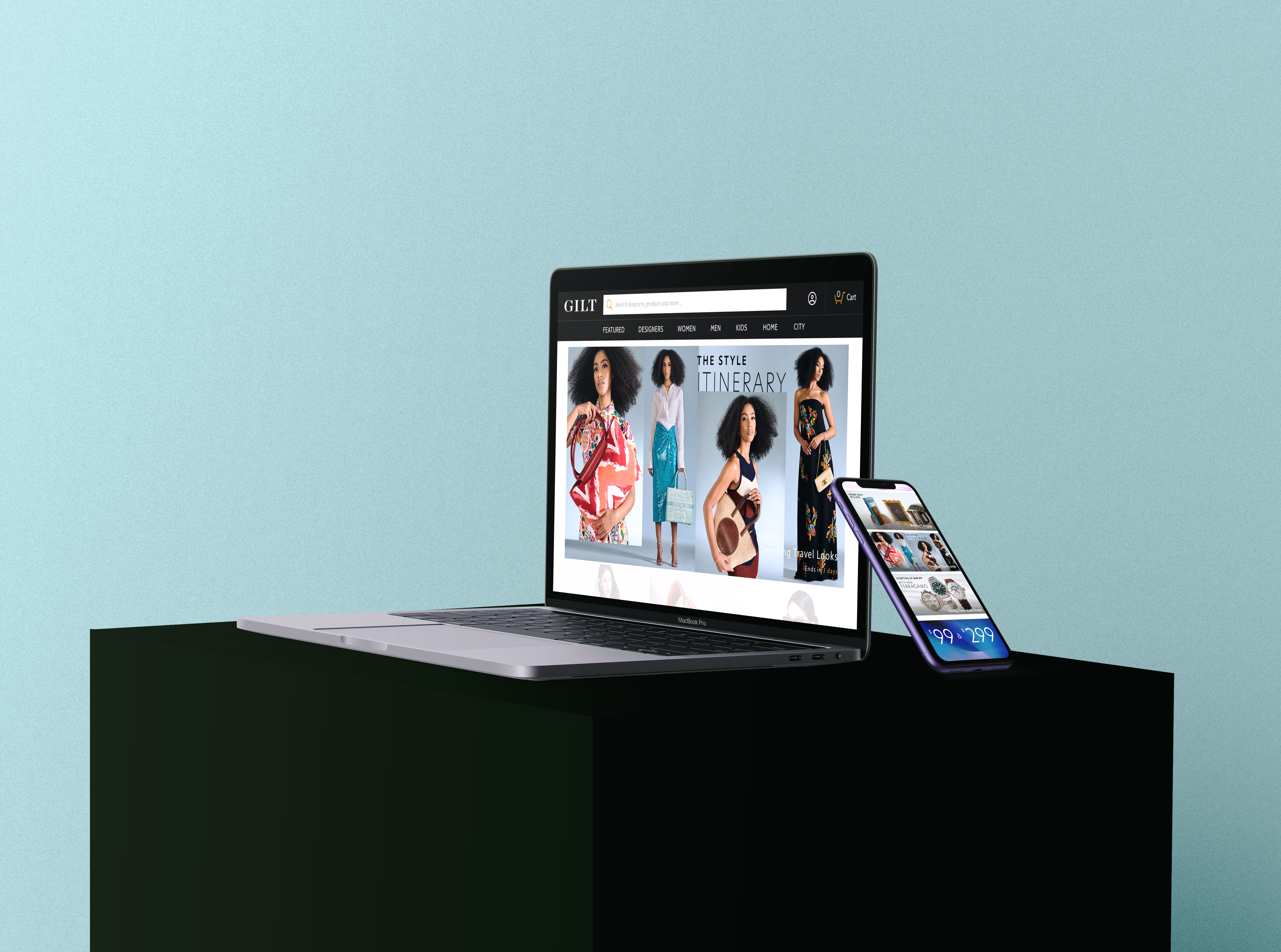
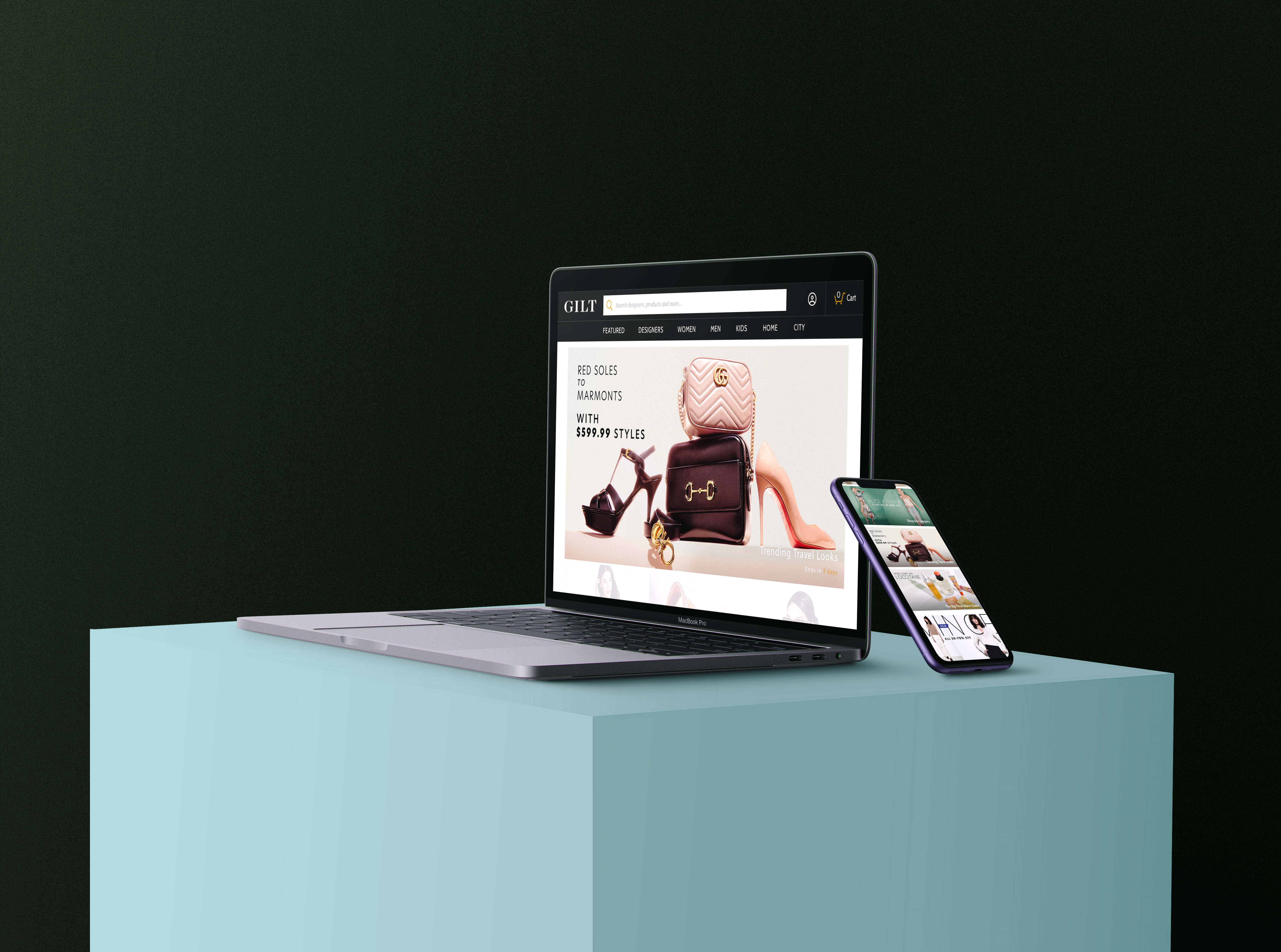
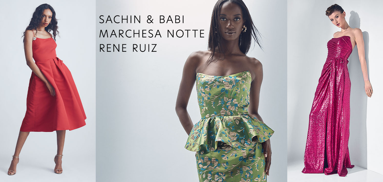
An example of a full boutique door set. The banner size is seen on mobile views or as the header on desktop, and the square size is seen on desktop. Not all assets are accompanied by an email, but an email is shown here as a comprehensive view.

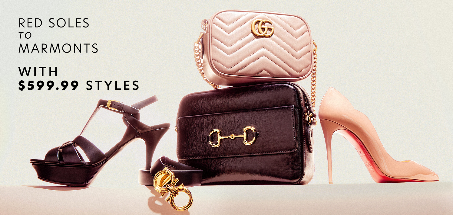
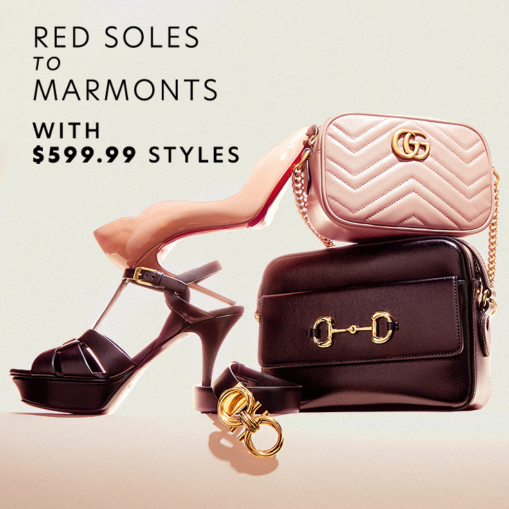
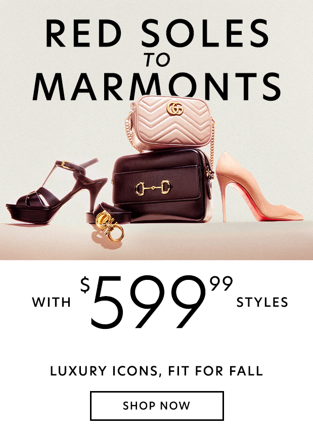
Product Laydown Example
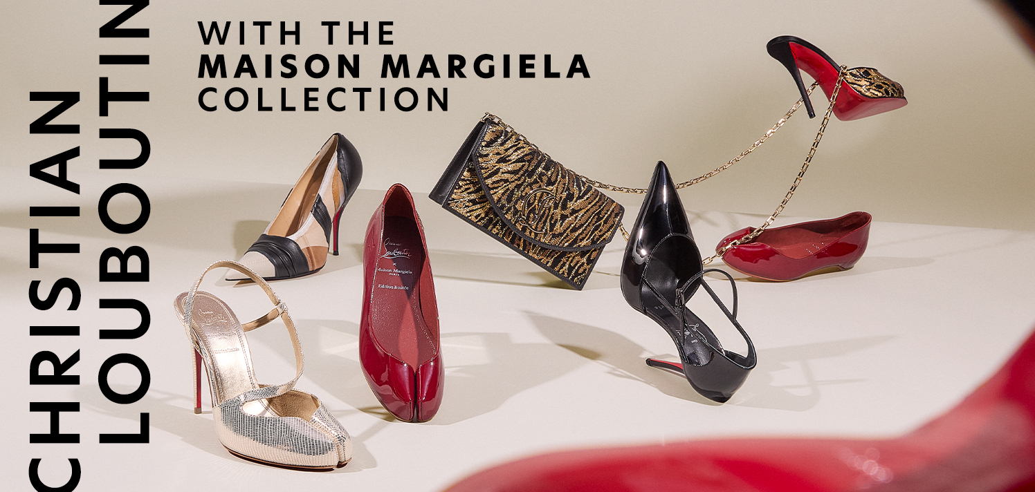
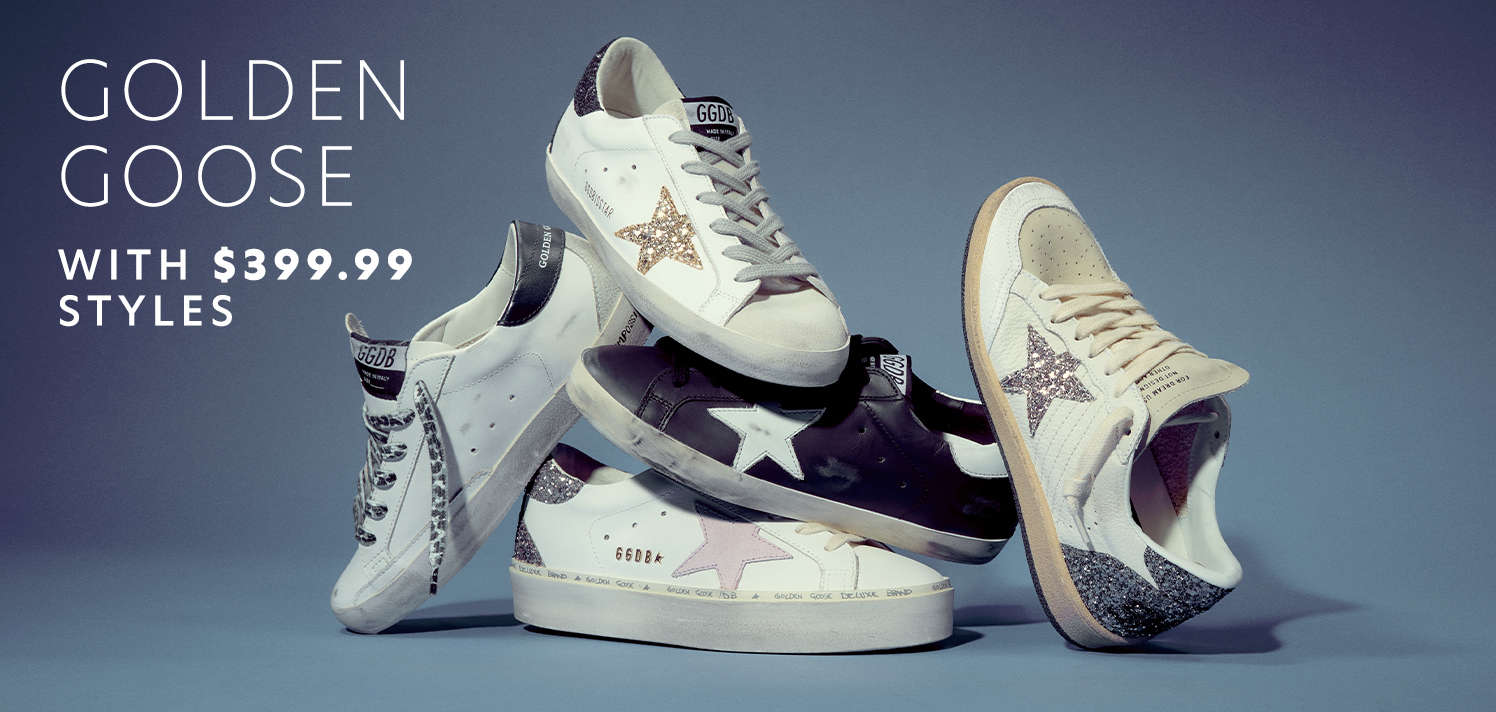
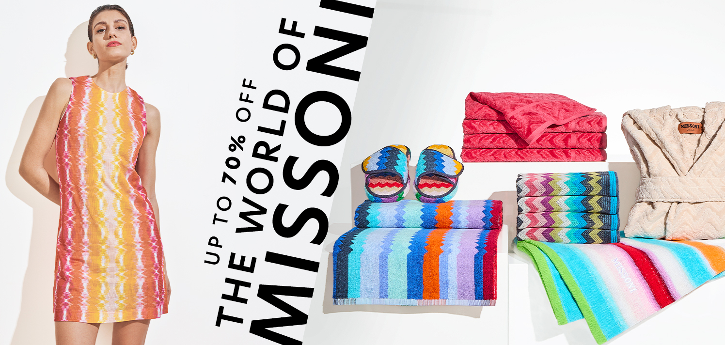
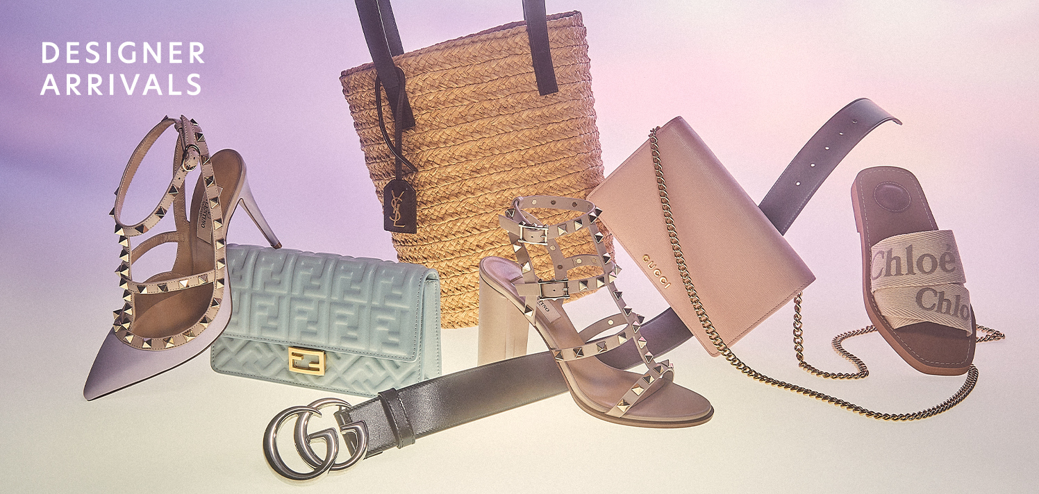
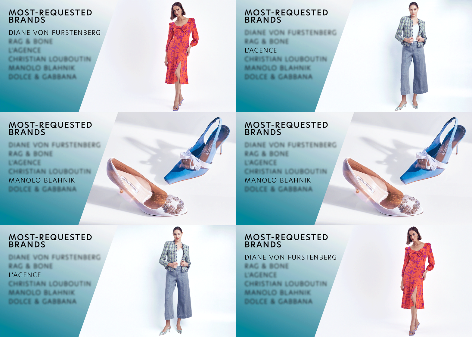
Product laydowns and on model assets follow the same templates. However, type/copy are treated differently depending on the situation and context.
Graphic Example
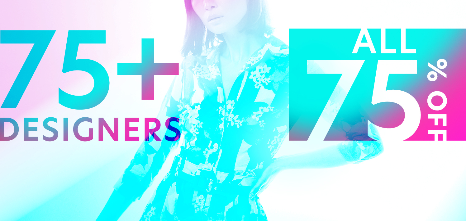
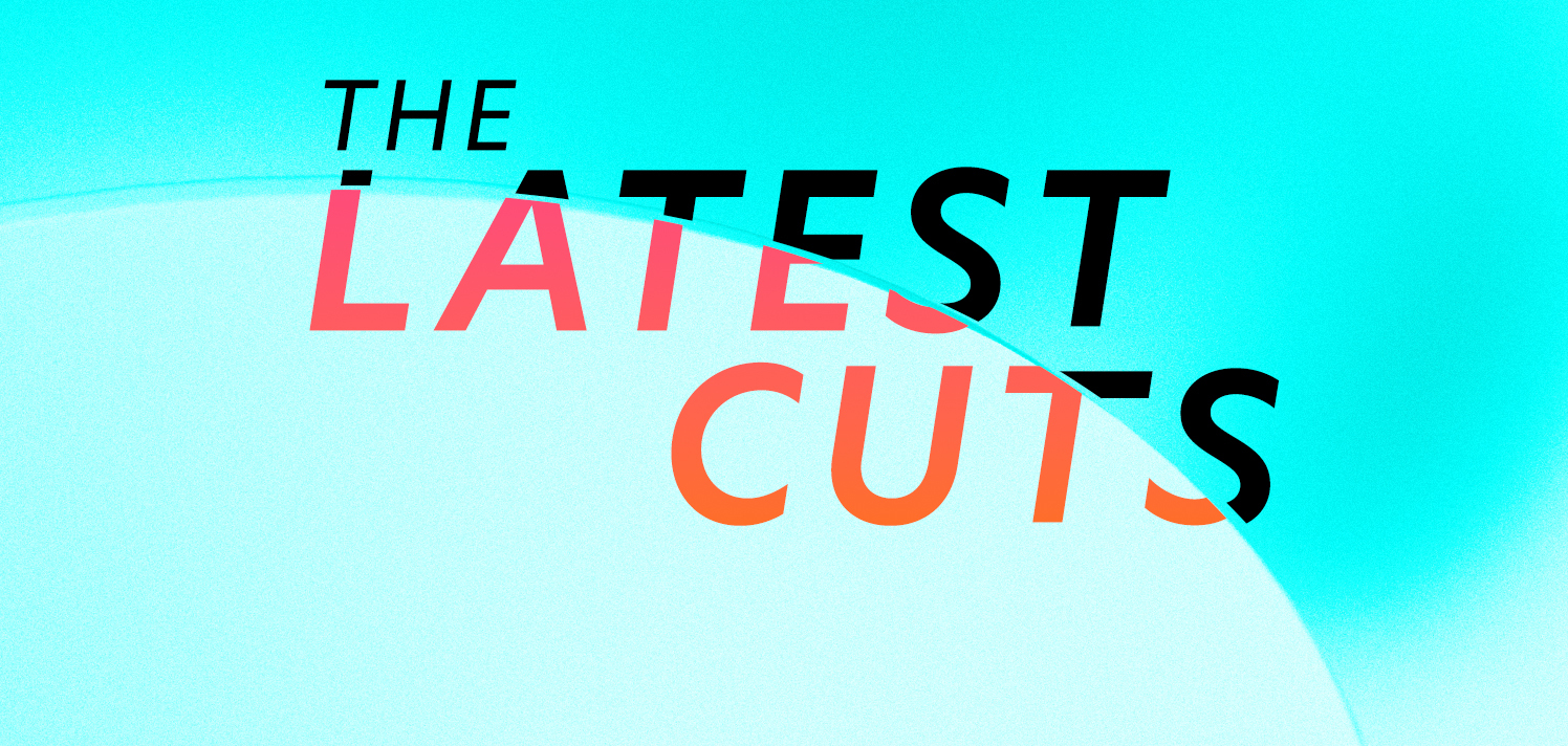
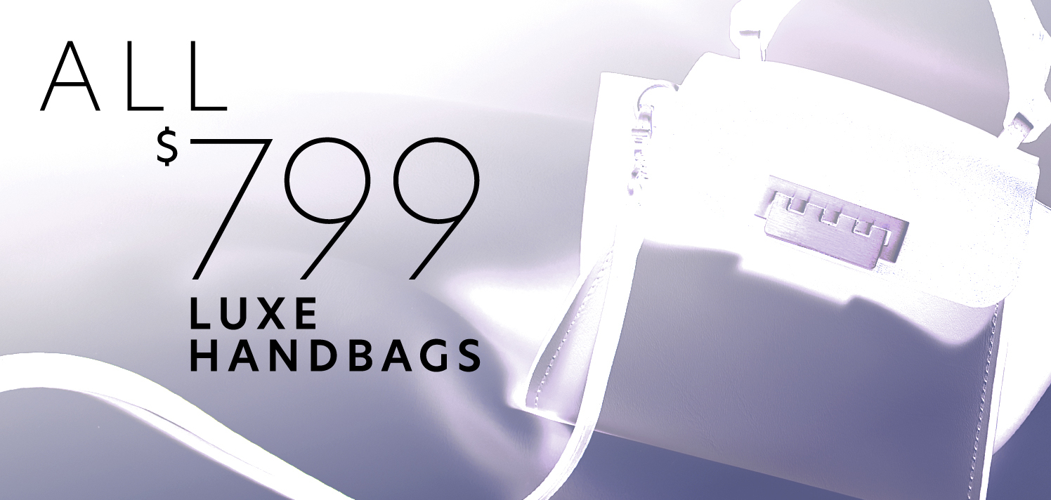
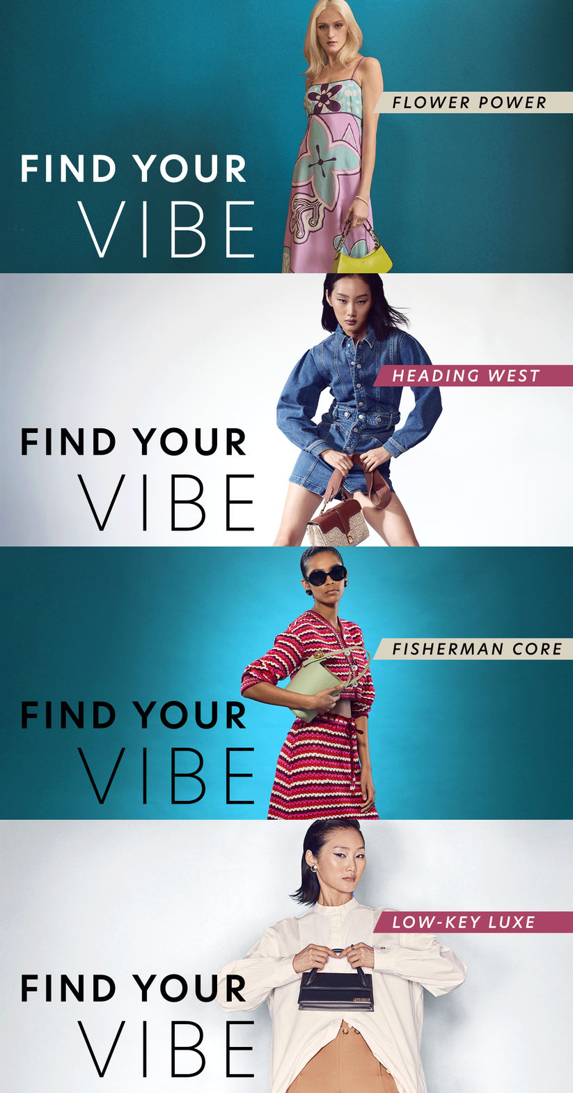
Graphic assets are where designers usually have more creative freedom. Backgrounds are abstract and purposefully vague so as not to allude to any specific product being sold. Copy is written beforehand so I like to align design to play into the text. In the examples below you’ll also see a shift from reds/oranges to neon blues/magentas as there was a graphic refresh as part of the 2025 Q1 brand identity.
![]()
![]()
![]()
![]()
![]()
![]()
![]()
![]()
![]()
![]()
![]()
![]()
![]()
![]()
![]()
![]()
![]()
![]()
![]()
![]()
![]()
![]()
![]()
![]()
![]()
![]()
![]()
![]()
![]()
![]()
![]()
![]()
![]()
![]()
![]()
![]()
![]()
![]()
![]()
![]()
![]()
![]()
![]()
![]()
![]()
![]()
![]()
![]()
Graphic assets are where designers usually have more creative freedom. Backgrounds are abstract and purposefully vague so as not to allude to any specific product being sold. Copy is written beforehand so I like to align design to play into the text. In the examples below you’ll also see a shift from reds/oranges to neon blues/magentas as there was a graphic refresh as part of the 2025 Q1 brand identity.
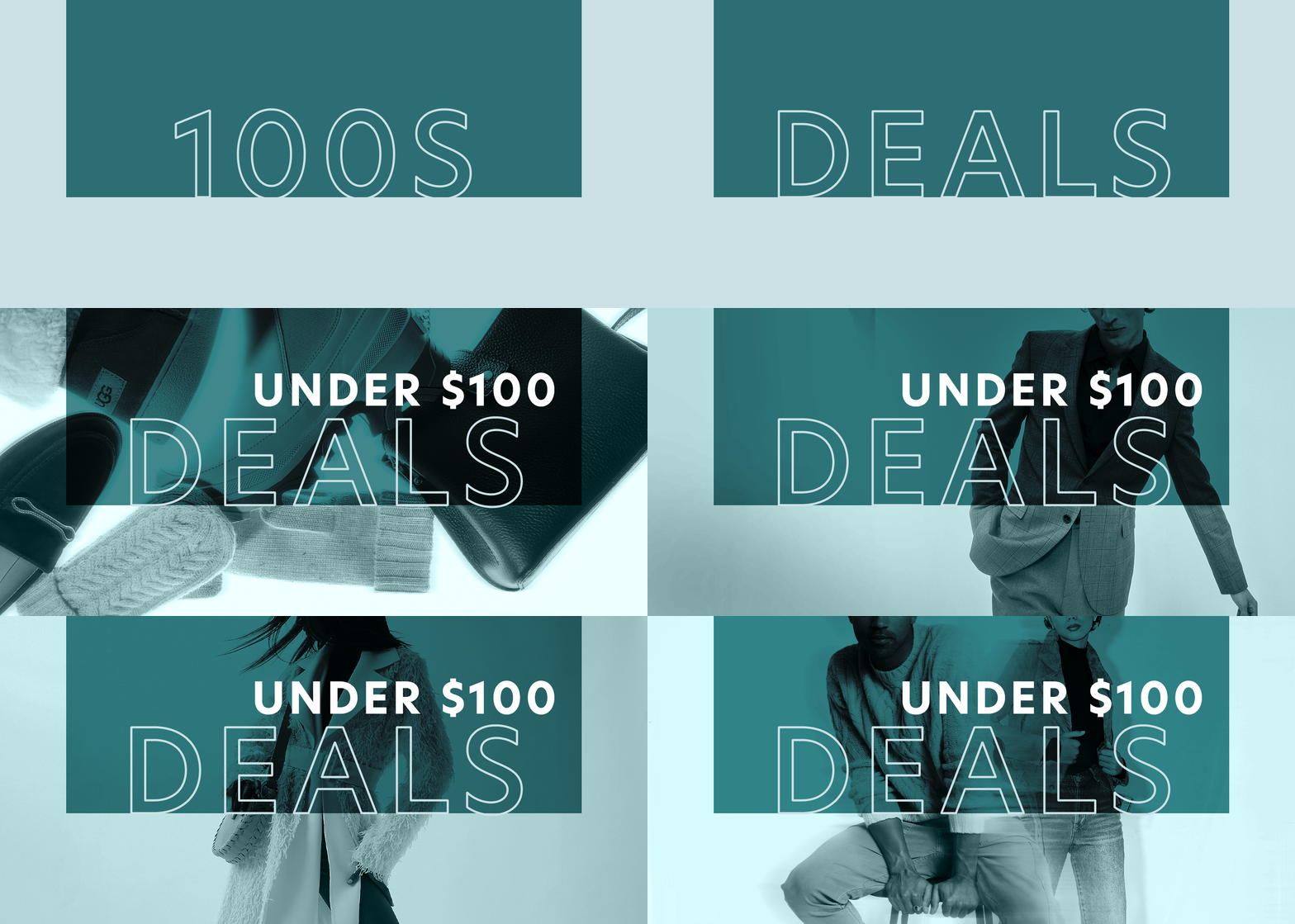
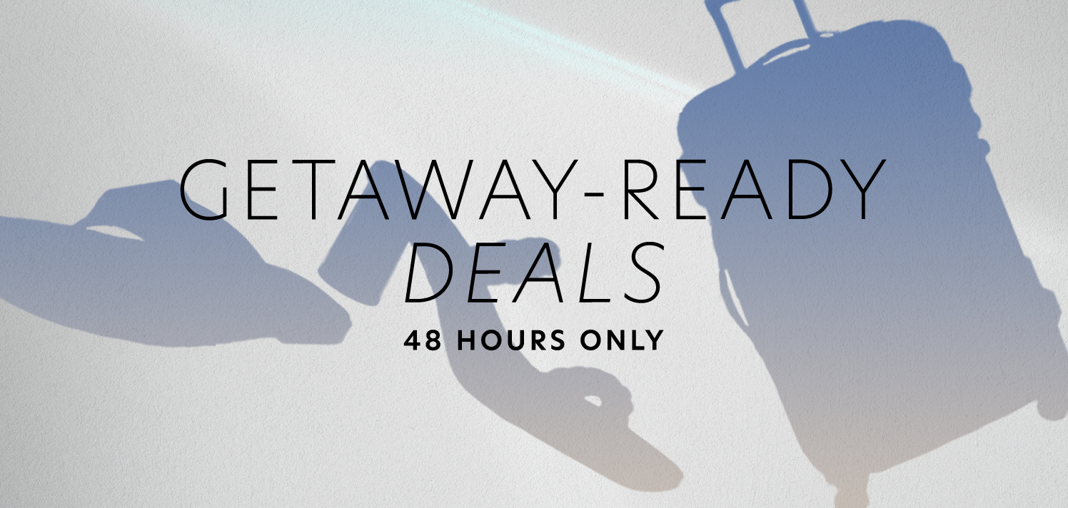
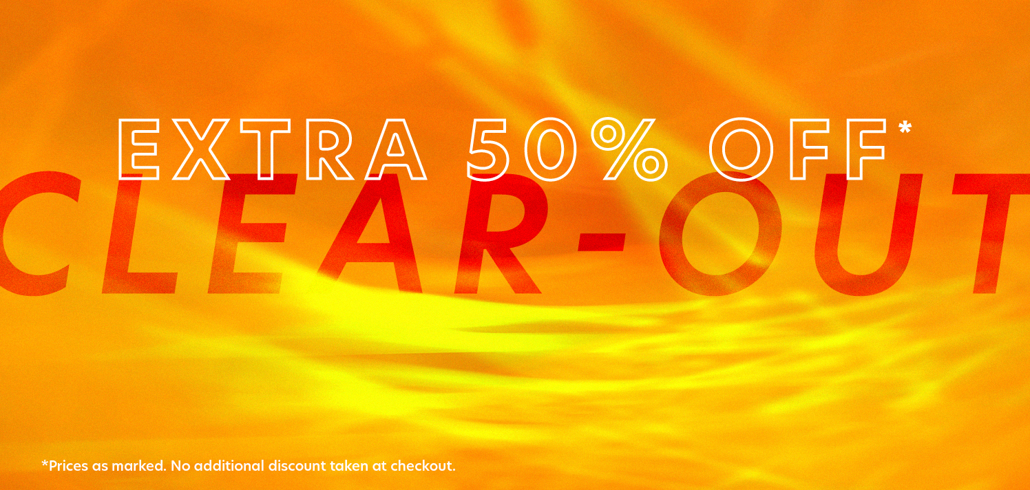

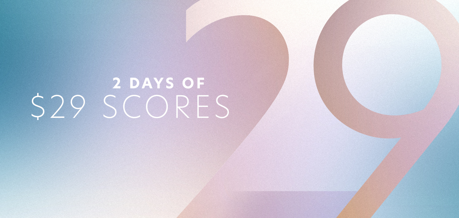


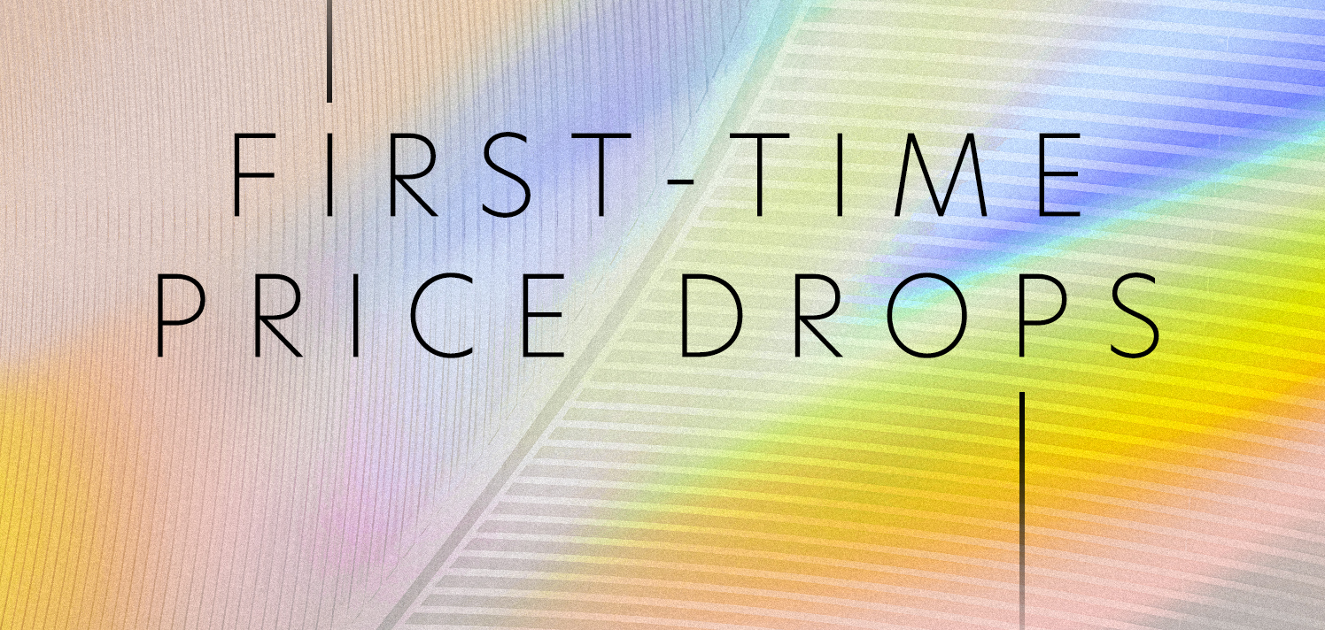

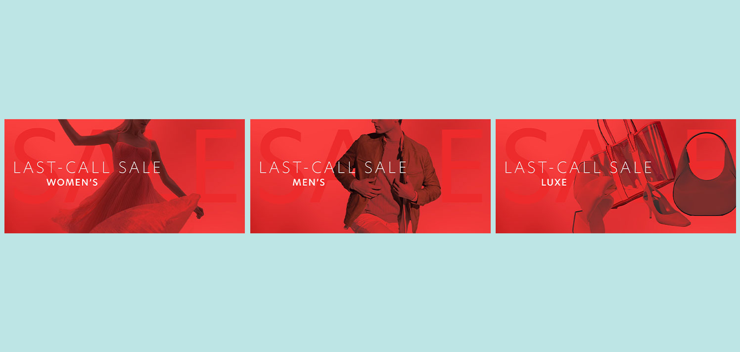
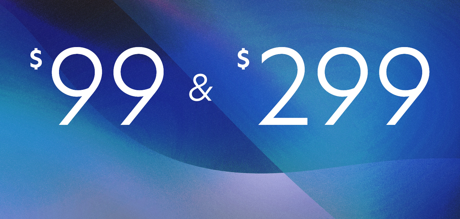
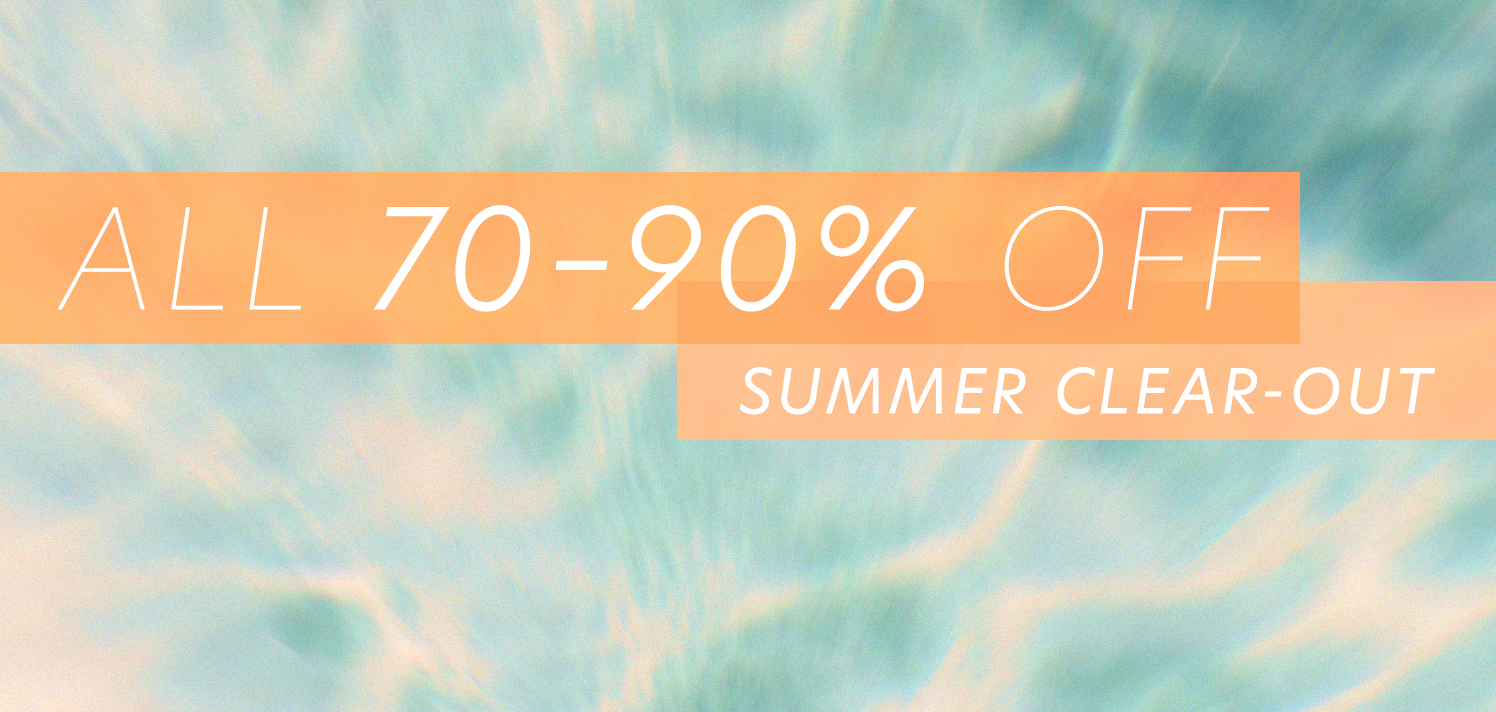
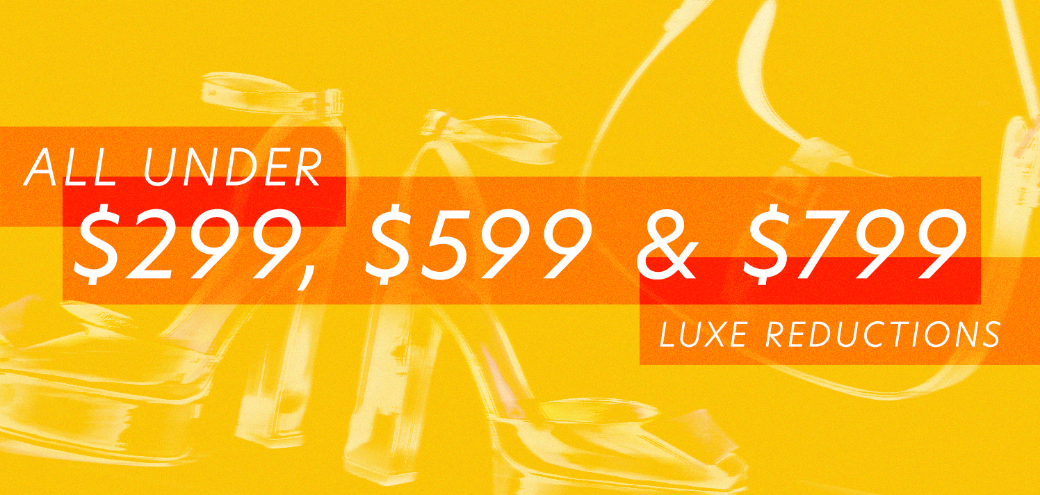


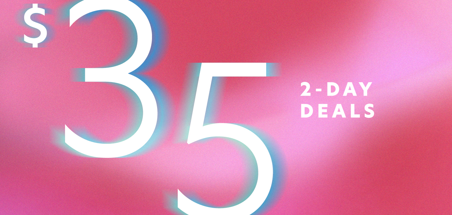

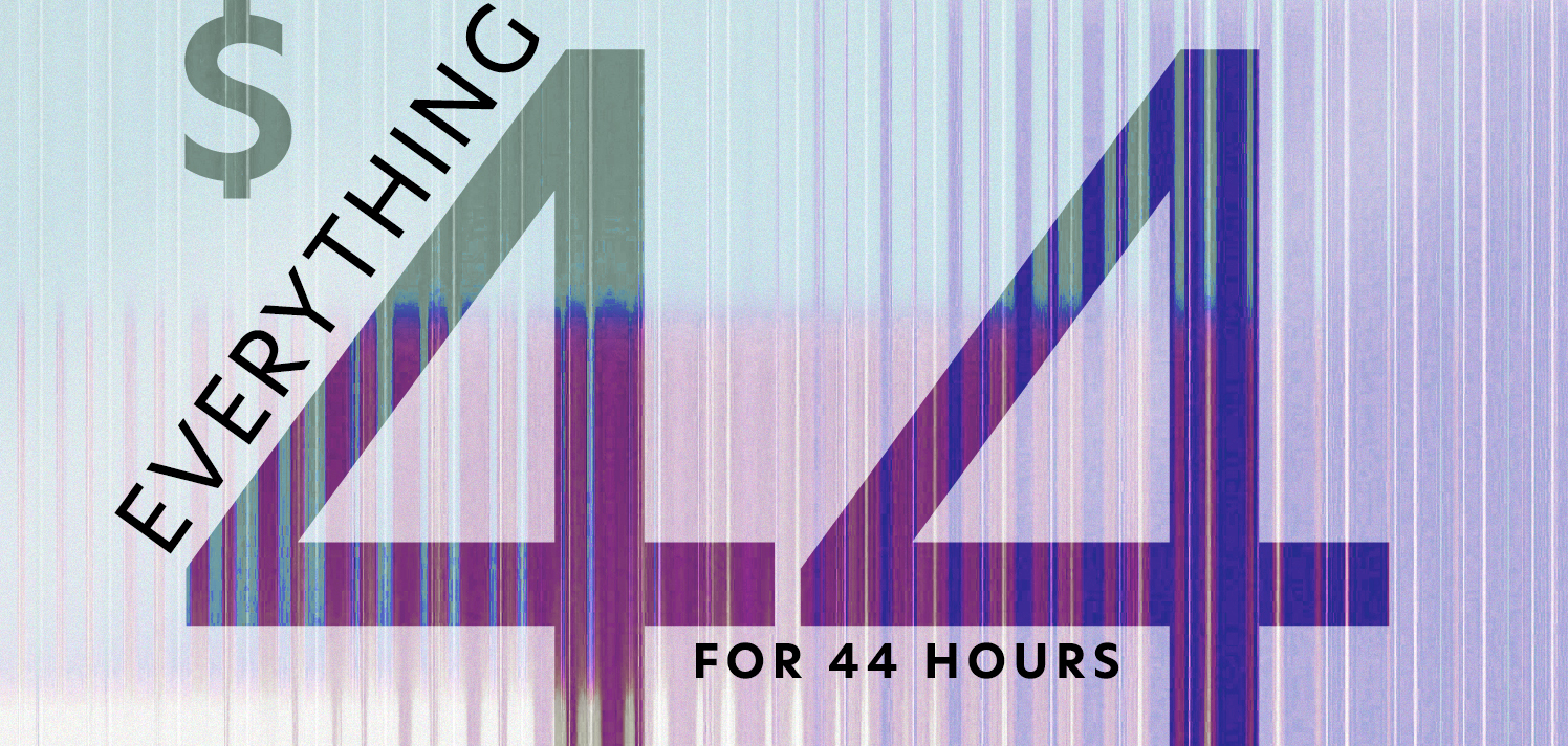

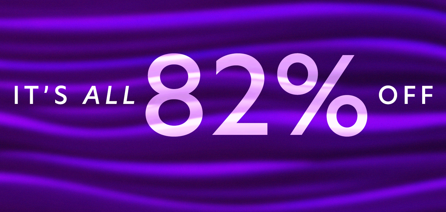
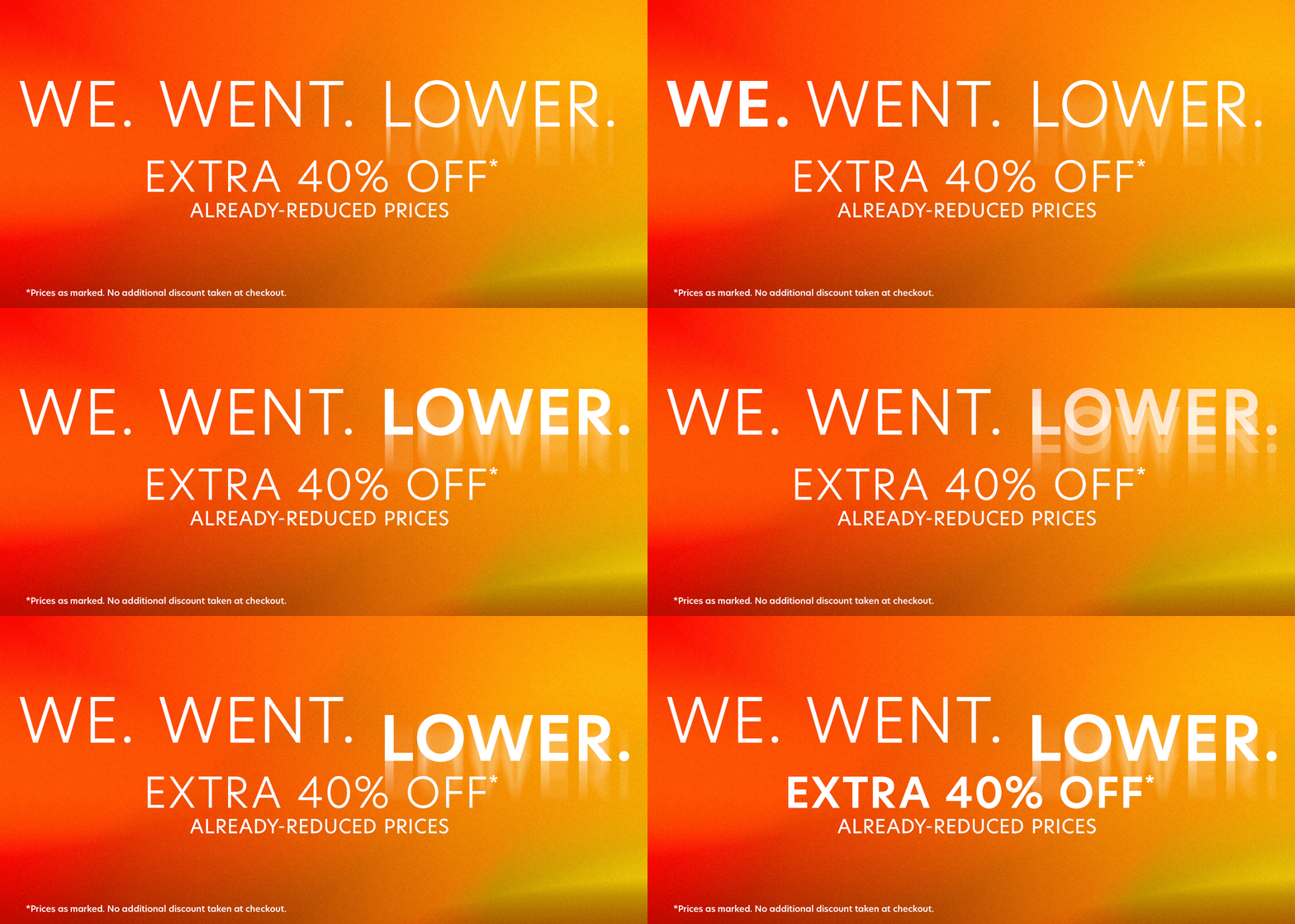


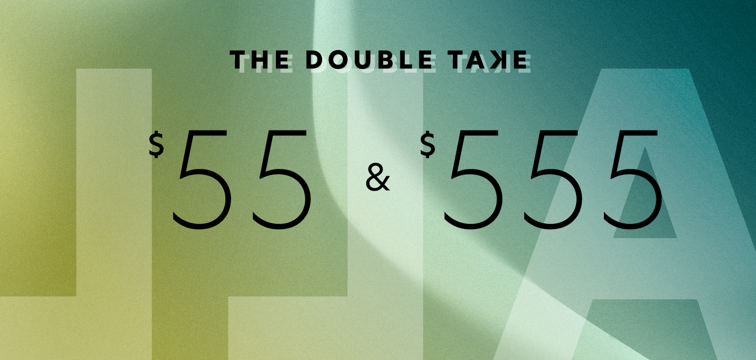
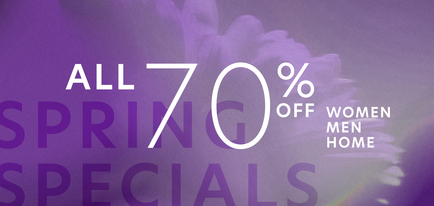
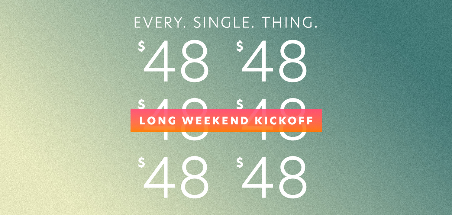
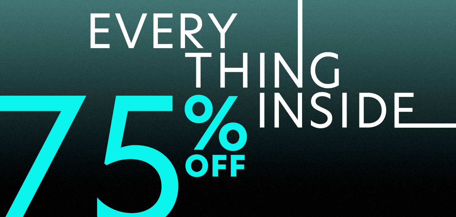

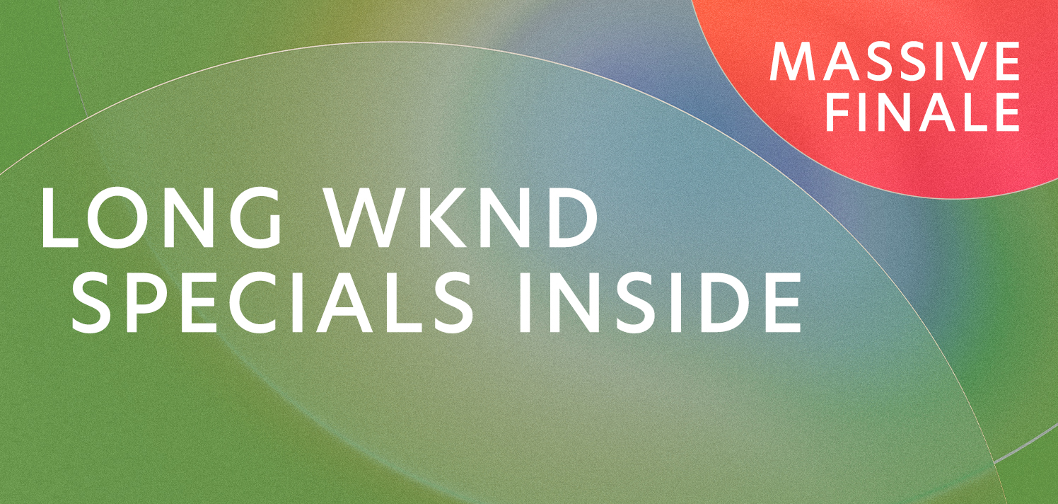
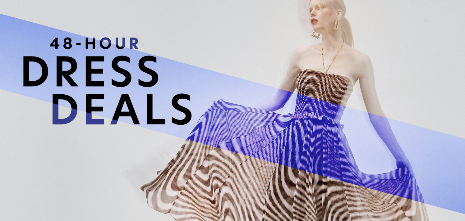

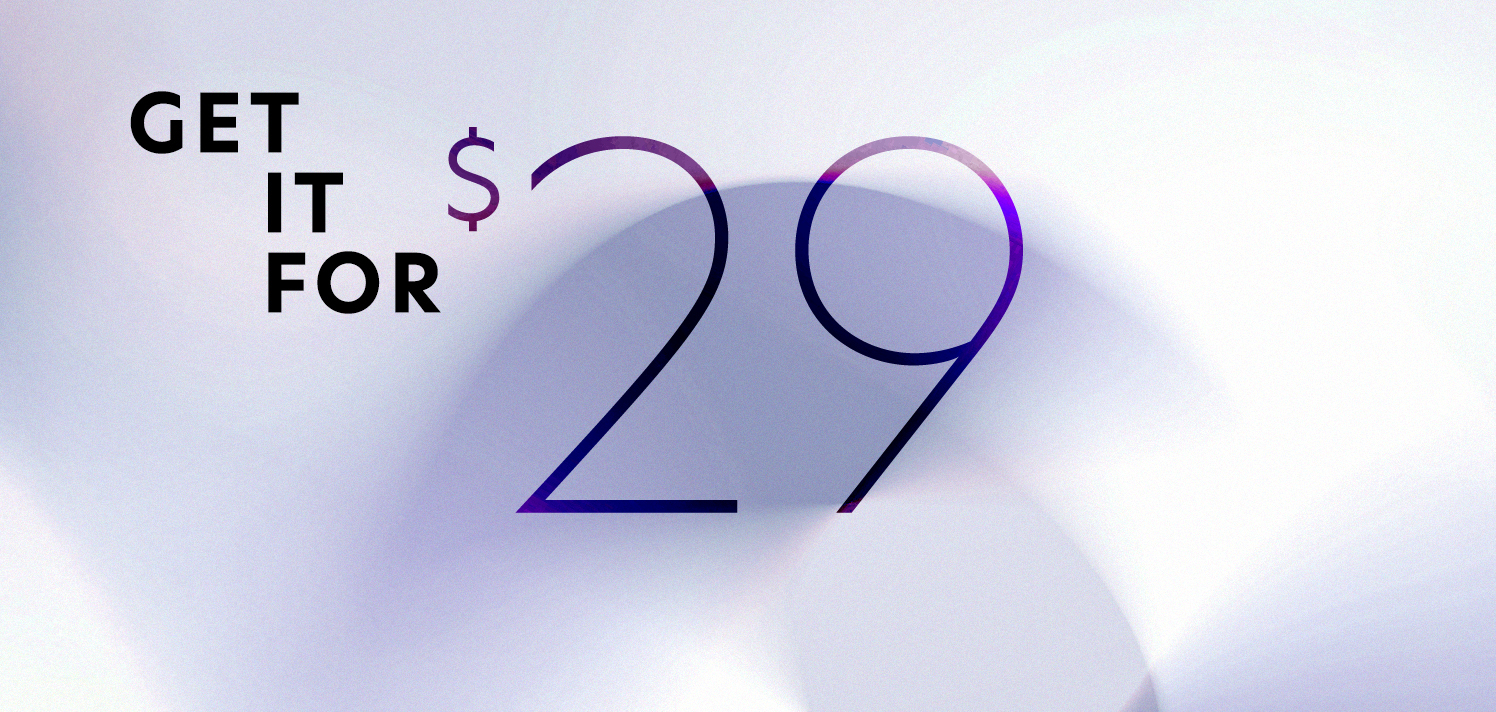
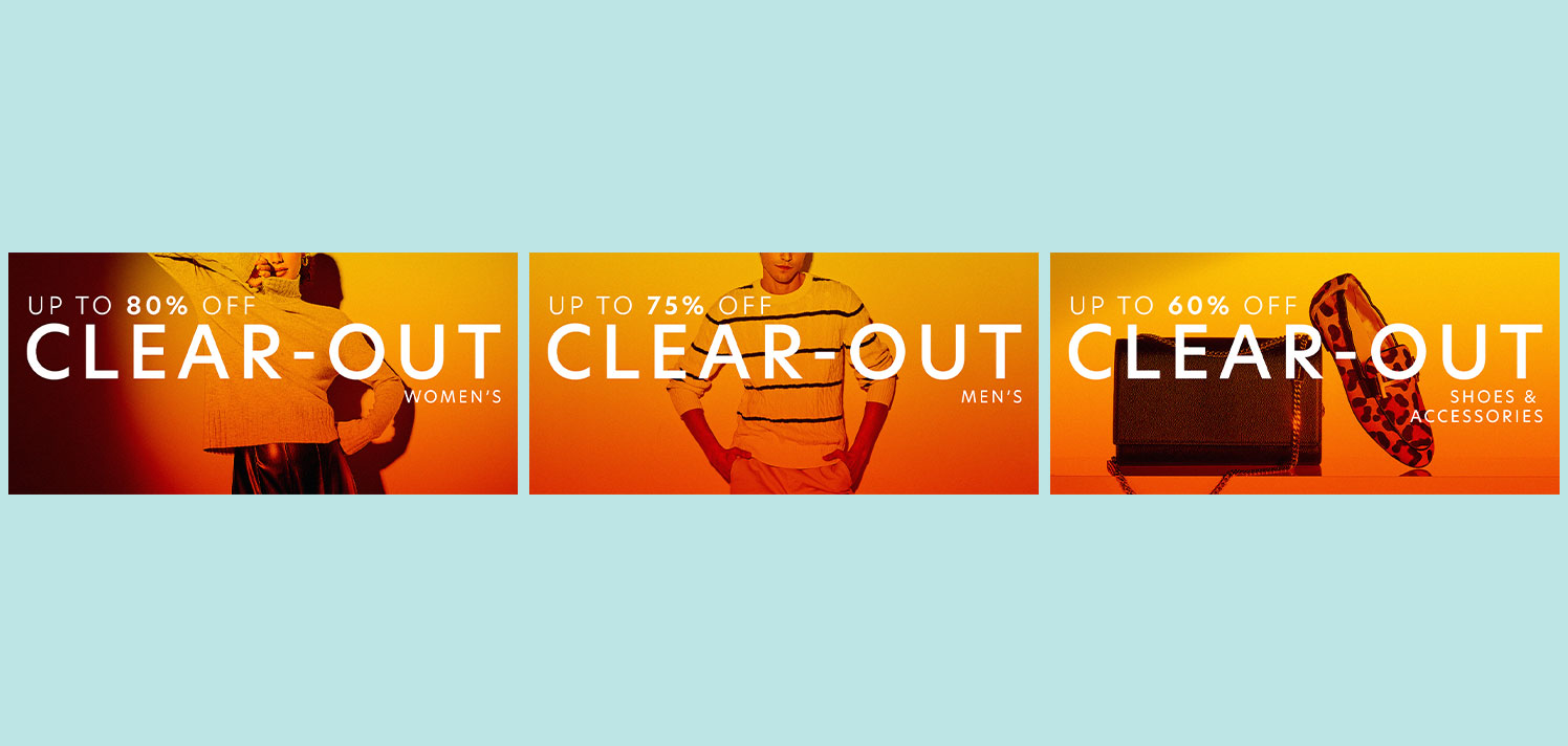

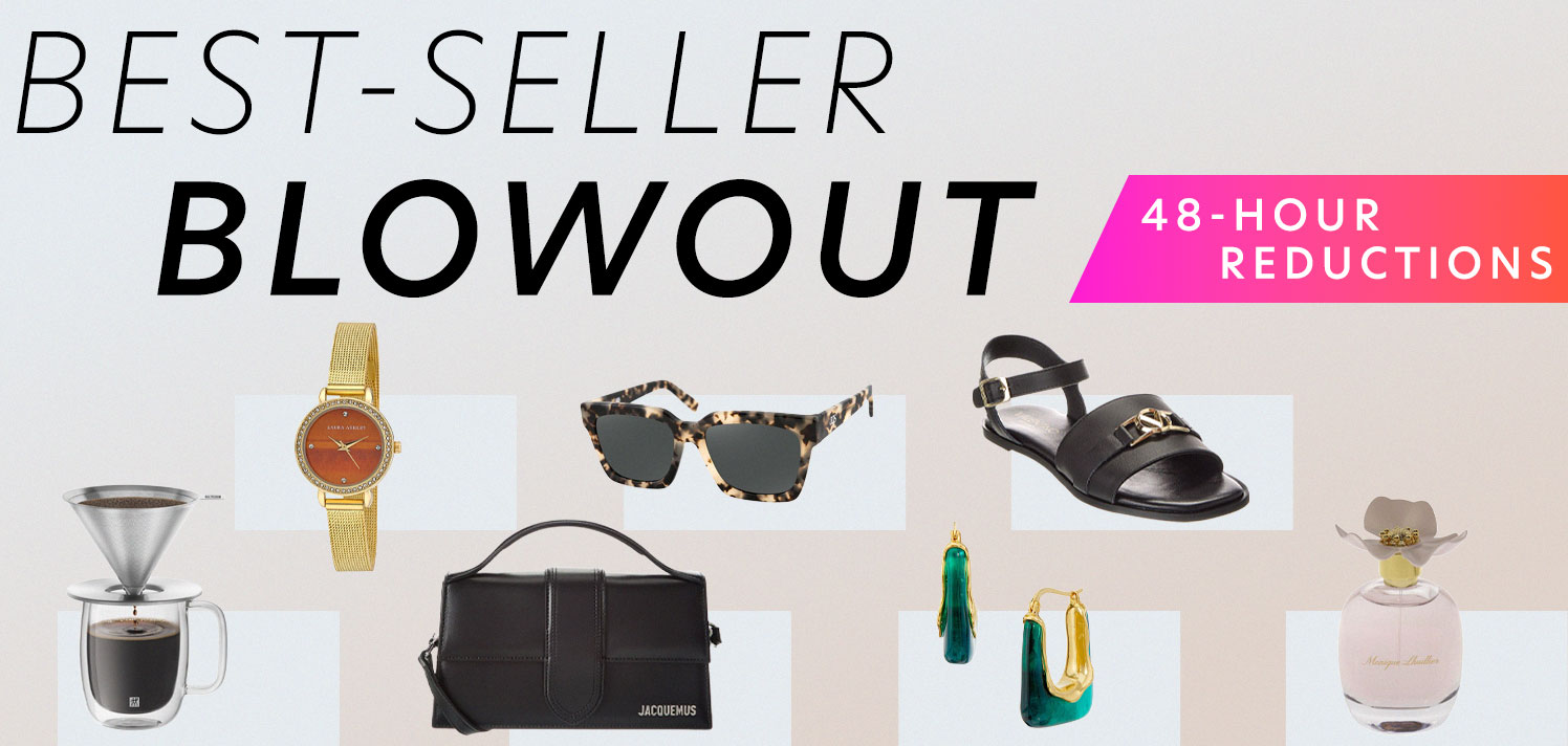
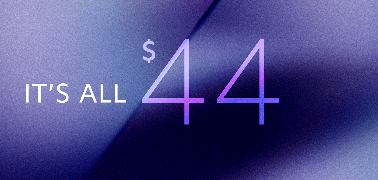


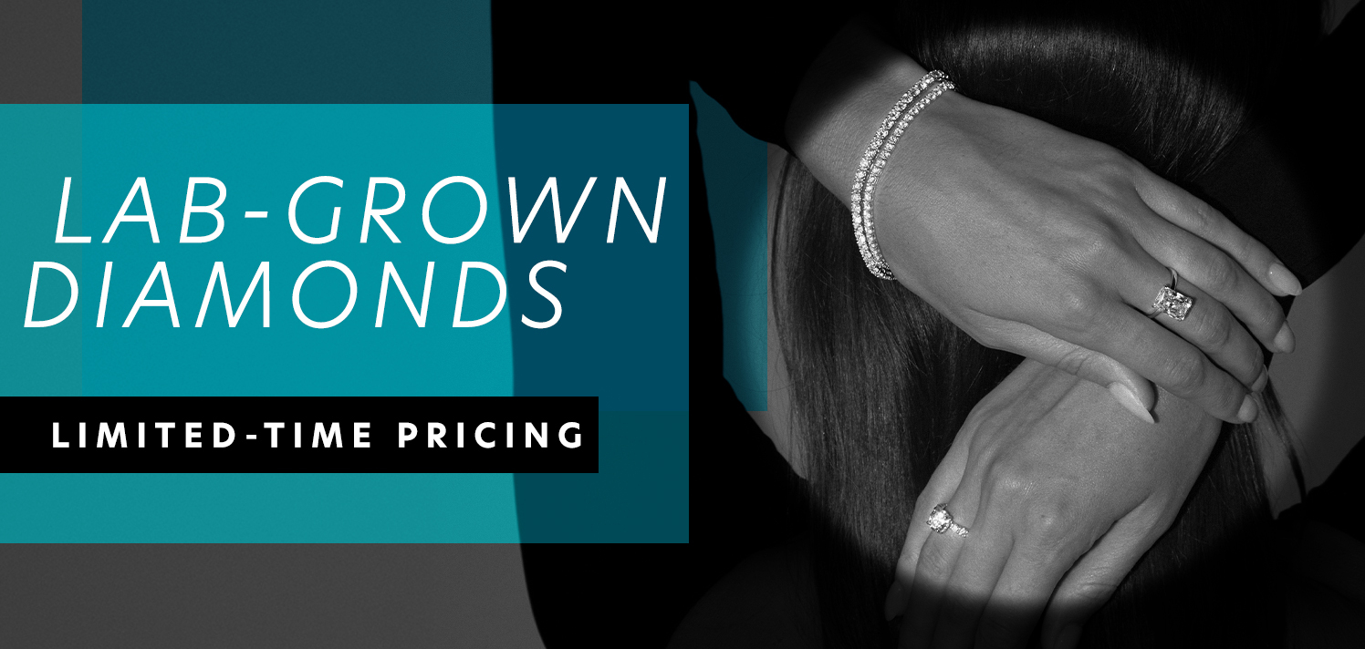

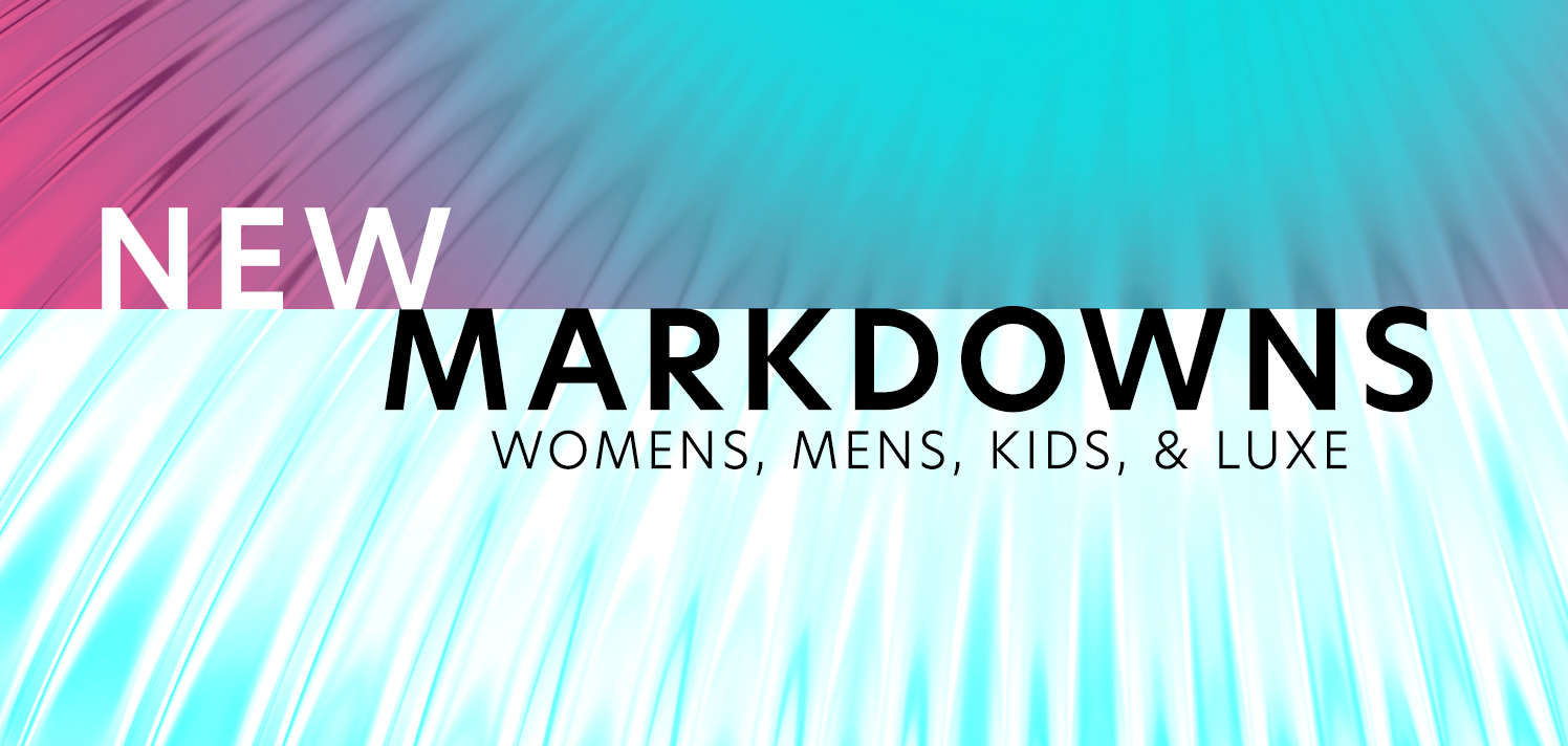

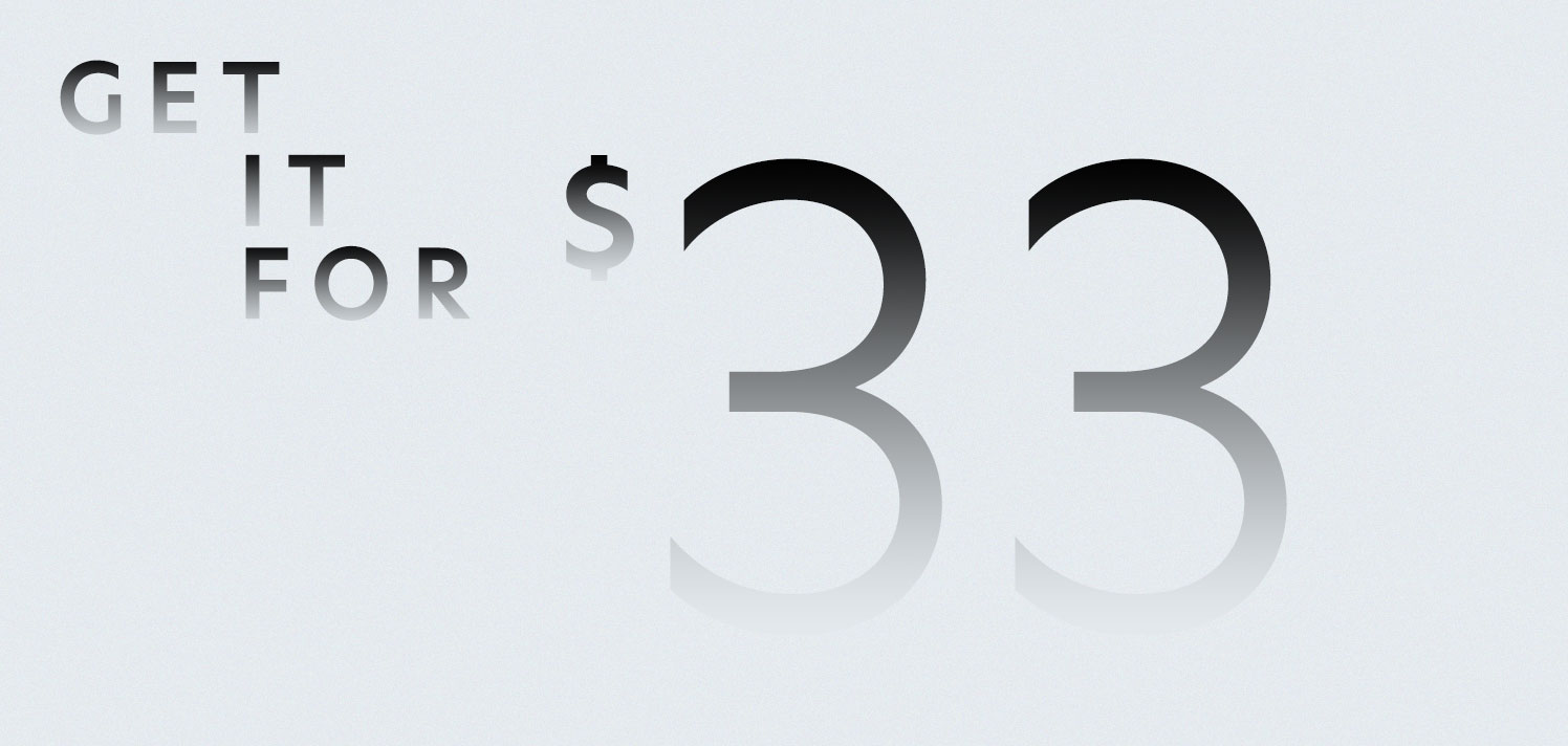
Image Selection
Images vary from in-house studio shoots to vendor and stock photography. Within the in-house studio photography, there is model and product flat laydowns, respectively shot in the Boston and Kentucky studios. With all photography, but especially within in-house images, there is special attention to the photo editing to make sure the assets align to the current season and brand. For example, Gilt maintains a clean, high-end brand identity. Scuffs and scratches are removed from the floor, risers and wax are edited out of product laydowns, as well as any visible tattoos or blemishes on the skin, distracting prop elements might also be smoothed over to refocus attention on the product being sold, and more as necessary.
On Model Example
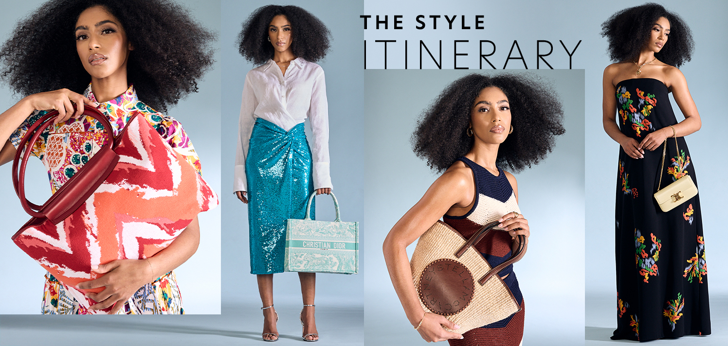
In this example, three shots from different shoots were combined together into one asset. Considerations included matching the tone of the background, how the model posing works against or with each other, and type placement on the asset. From each shoot, the final shot is highlighted in red.


Once the shots are chosen, the editing process begins. For this asset, I first matched the lightest background to the neutral tone in the current color palette and then matched the other two shots to that same neutral. Scratches are removed from the background, any blemishes on the skin and wrinkles in the clothing are smoothed, and backgrounds are extended. Skin tones should feel similar to the model’s natural coloring while also blending in with the toning that the background has been edited to.


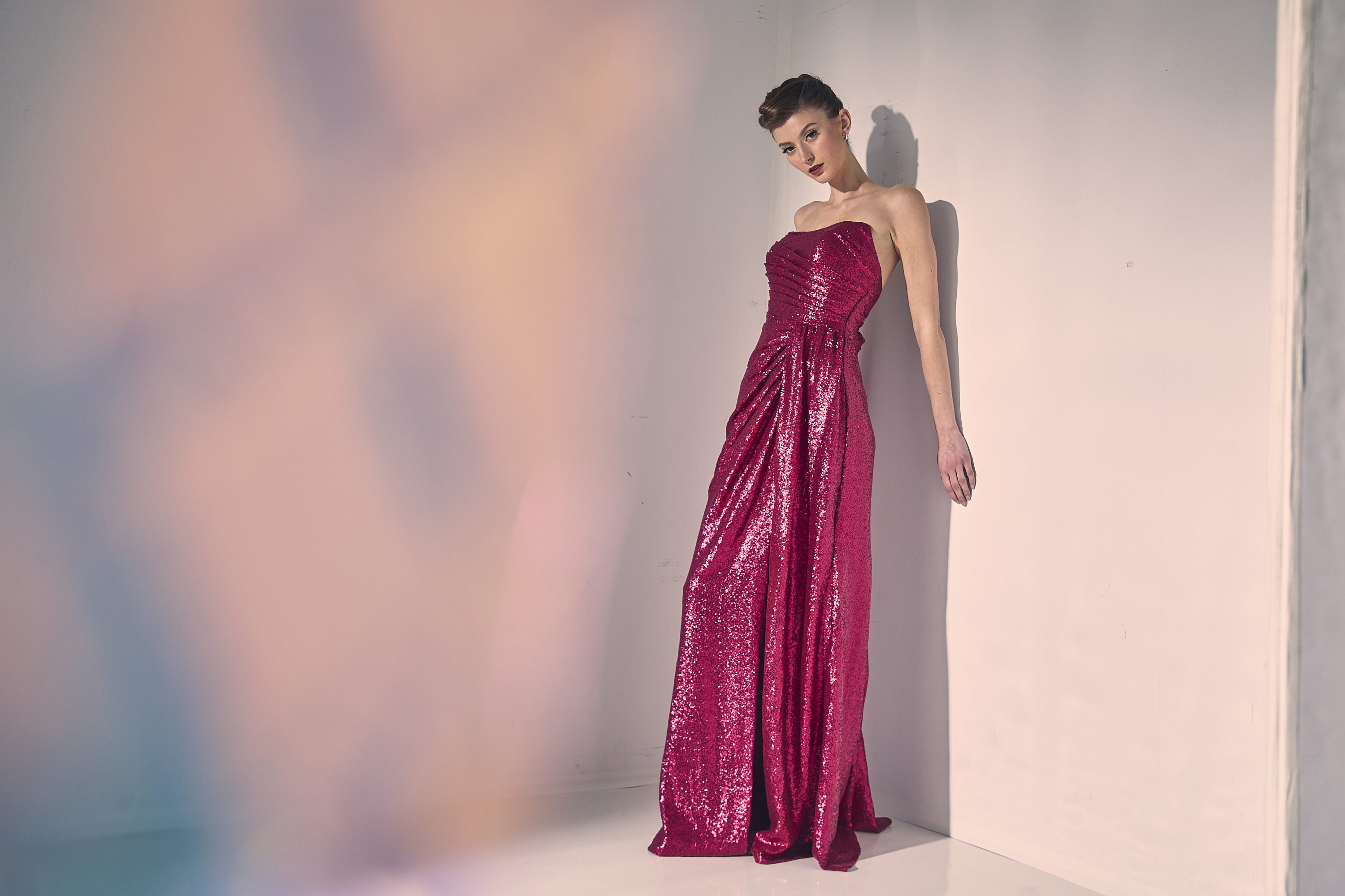
The final approved asset:
Product Laydown Example
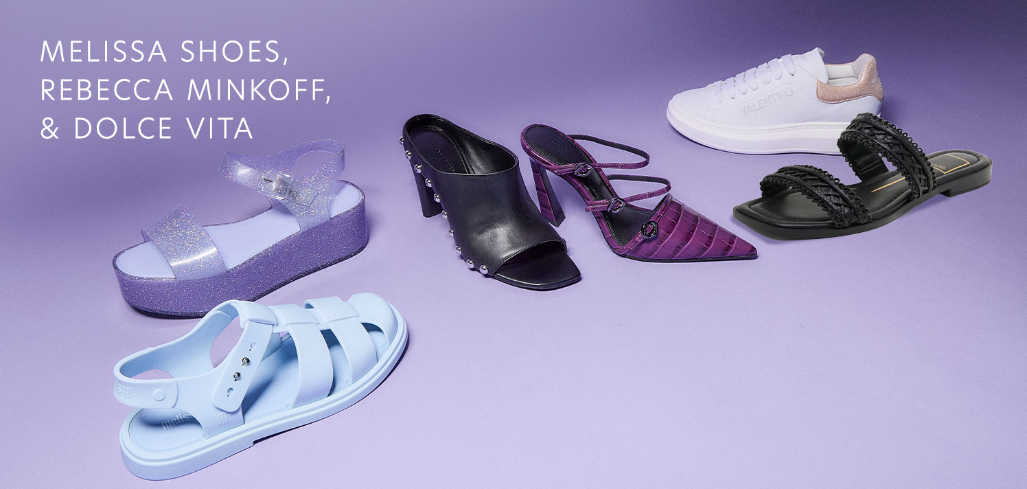
In this example, the color editing is minimal and it was shot in the current season and already matched to the color palette. However, the merchandising request changed after the products had already been shot by the studio. So, the final request was to remove a shoe and replace it with a PFP.


The final approved asset:
Color Palette
The color palettes shifts with each quarter according to season. There is an effort to keep colors differentiated between the Gilt and RueLaLa brands. New studio imagery is often shot for the current season but past imagery is also often reused and adjusted to align with the corresponding colors through blending modes while maintaining the original quality and lighting as much as possible. Below is a snapshot of the shift in color palettes throughout 2024 and how that was reflected through the designed assets.


